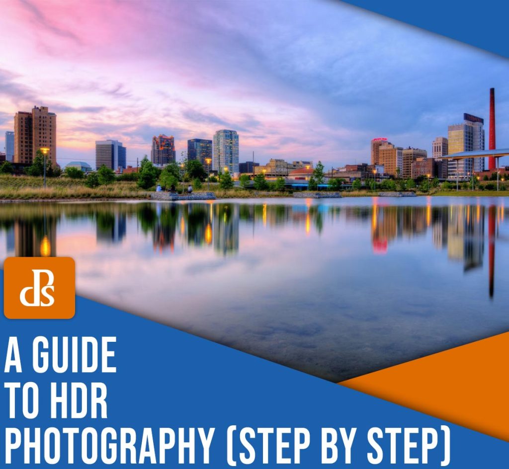
The post HDR Photography: A Step-By-Step Guide appeared first on Digital Photography School. It was authored by Barry J Brady.
The HDR technique is a great way to capture well-exposed images of high dynamic range scenes. In fact, it’s an approach used by many professionals, including landscape, travel, real-estate, and architectural photographers.
But the technique can be a bit tricky, and that’s where this article comes in handy. Below, I explain everything you need to know to get started with HDR imaging, including:
- What HDR photography is
- Step-by-step instructions for taking HDR photos in the field
- The best HDR software (both free and paid)
- Tips and tricks for top-notch results
So if you’re ready to unlock the full potential of this powerful approach, let’s dive right in!
What is HDR photography?
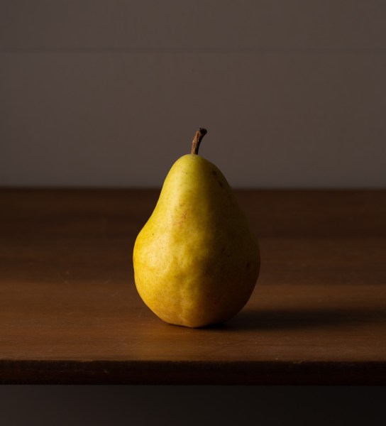
HDR photography is a technique where multiple bracketed images are blended together to create a single beautifully exposed photo.
In other words, you capture several photos with different exposures, then combine them – in a program like Lightroom or Photoshop – to create a highly detailed file.
Why is this necessary?
Your camera can only capture a limited range of lights and darks (i.e., it has a limited dynamic range). If you point your camera at a dark mountain in front of a bright sunset, no matter how much you tweak the image exposure, your camera will generally fail to capture detail in the mountain and the sky; you’ll either capture an image with a beautiful sky but a dark, detailless mountain, or you’ll capture an image with a detailed mountain but a bright, blown-out sky.
High dynamic range photography aims to address this issue. Instead of relying on the camera’s limited dynamic range capabilities, you take multiple photos that cover the entire tonal range of the scene.
Then you combine the detailed sections of each photo and finish with a file full of well-exposed shadows, midtones, and highlights.
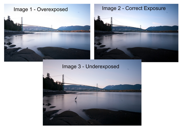
In the case of the mountain at sunset, you could take three images:
- A darker image to capture detail in the sky
- A brighter image to capture detail in the mountain
- A “standard” image to capture detail in the midtones
Then you could blend the three files, using the sky from dark image, the mountain from the bright image, and the midtones from the middle image.
When should you use the HDR approach?
Most scenes don’t require HDR techniques. Cameras have limited dynamic range capabilities, sure, but they’re still capable of handling most standard situations; in other words, you don’t need to do high-dynamic range photography all the time.
And HDR techniques come with significant limitations. To use the HDR process, you need to take at least two “starter” images, and neither the scene nor the camera can shift from shot to shot. You should (almost) always use a tripod, and you should aim to capture stationary scenes with little-to-no movement.
Therefore, I don’t recommend HDR photography when shooting action, such as sports, wildlife, birds, or even portraits; your subjects will move frequently, and you’ll struggle to get two bracketed images that can be effectively blended together.
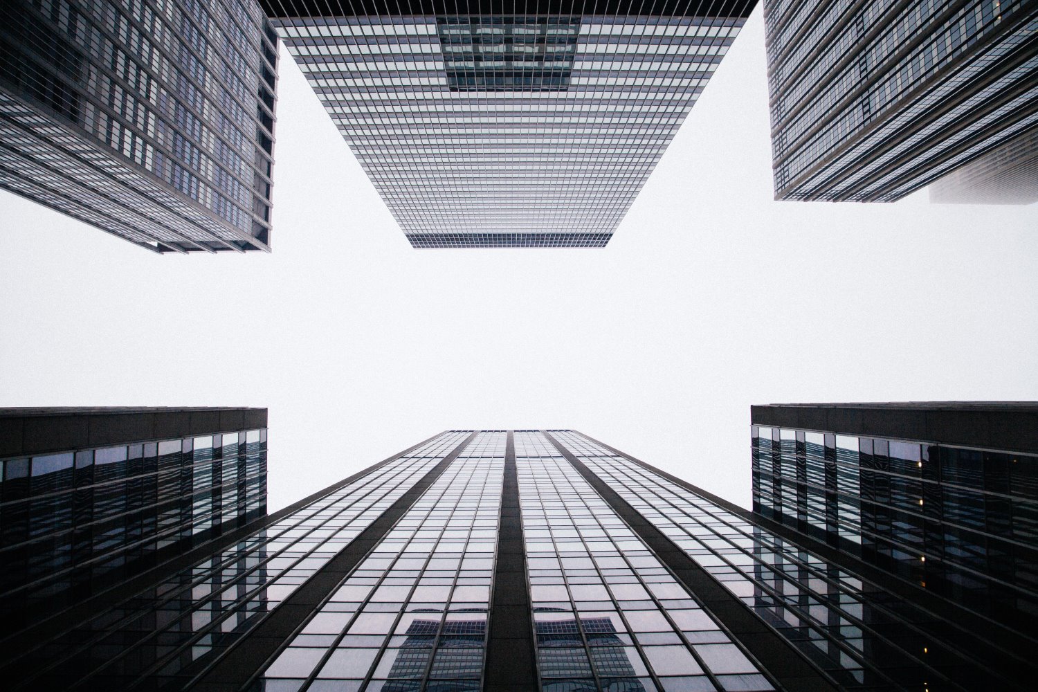
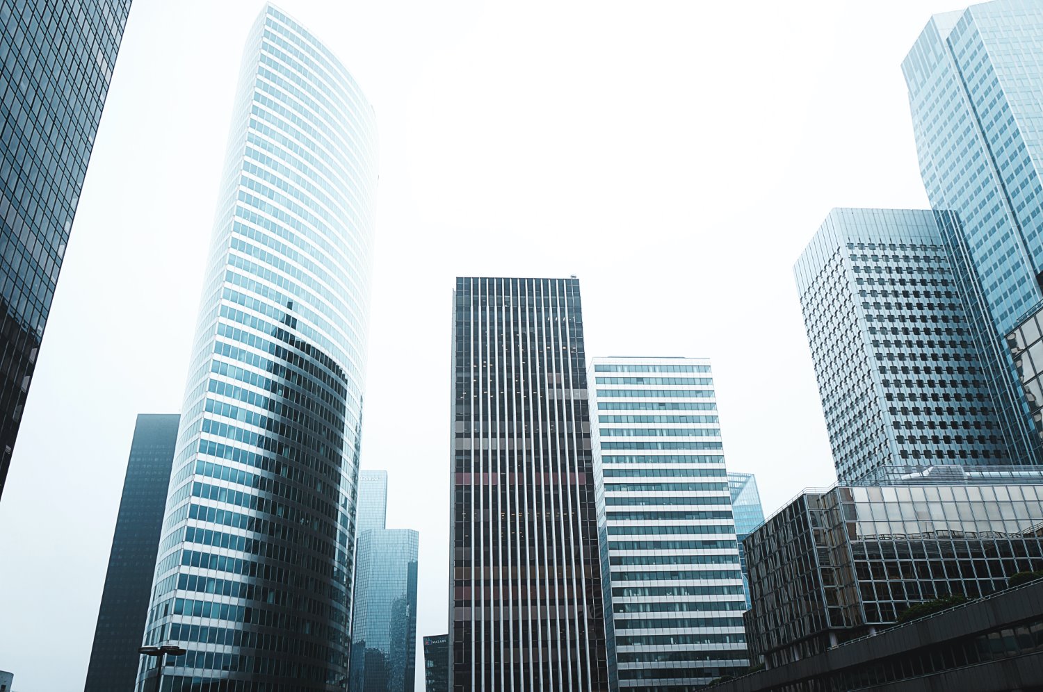
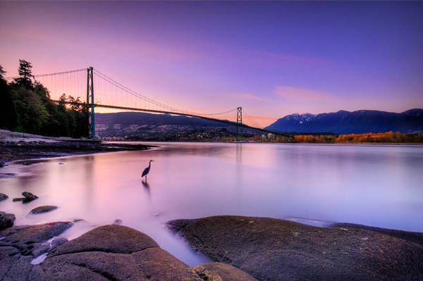
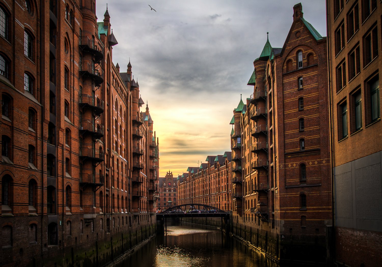
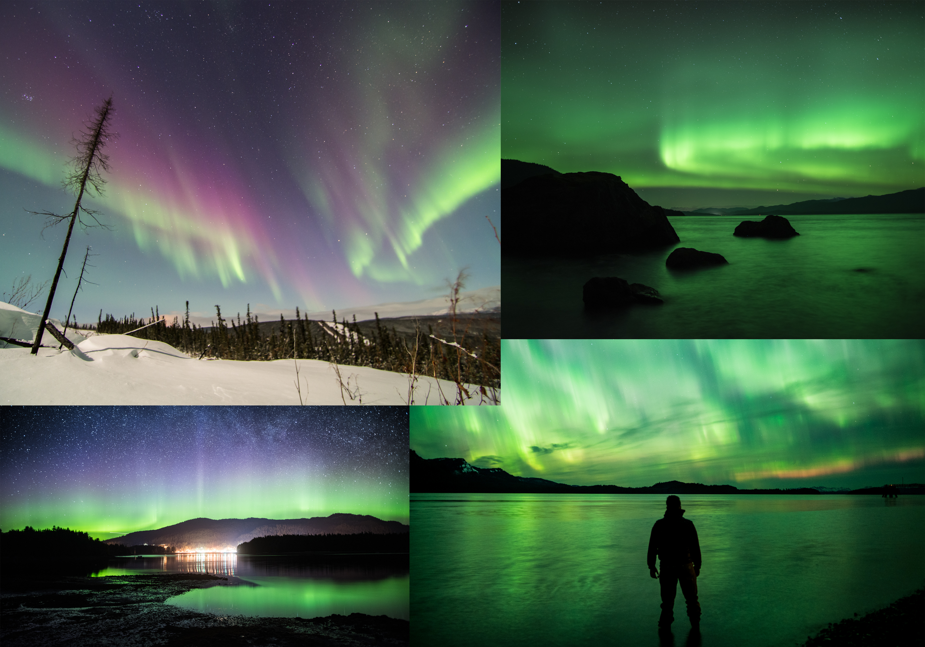
On the other hand, HDR techniques are great for landscape photography, real estate photography, architectural photography, and cityscape photography. These genres allow for slow, tripod-based shooting, and the scenes feature limited movement, too.
More specifically, you should use HDR photography when you encounter stationary scenes with very light and very dark tones. Here are a few common scenarios where HDR techniques can be a big help:
- Sunrise and sunset landscape and cityscape scenes (with a bright sky and a dark foreground)
- Real-estate and architectural interior scenes (with bright windows and/or artificial lighting)
- Twilight and night scenes (with artificial lighting and deep shadows)
- Landscape scenes with a mix of bright light and shade
Of course, it’s impossible to say for sure whether a scene will benefit from an HDR treatment, and camera sensors are steadily getting better at handling high dynamic range scenes. But when in doubt, you can always shoot a few bracketed exposures; that way, when you arrive home, you can decide whether you captured enough detail in one of your shots or whether you need to blend the files together.
A key problem: avoiding the HDR look
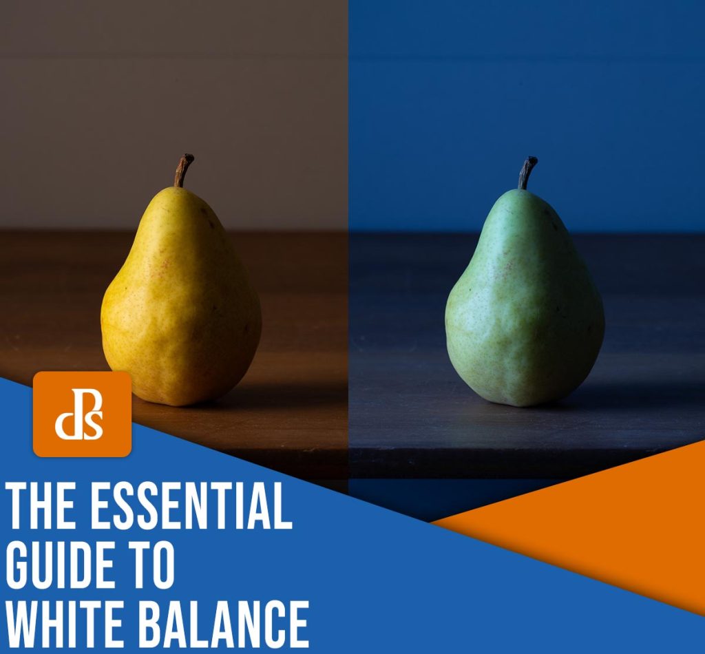
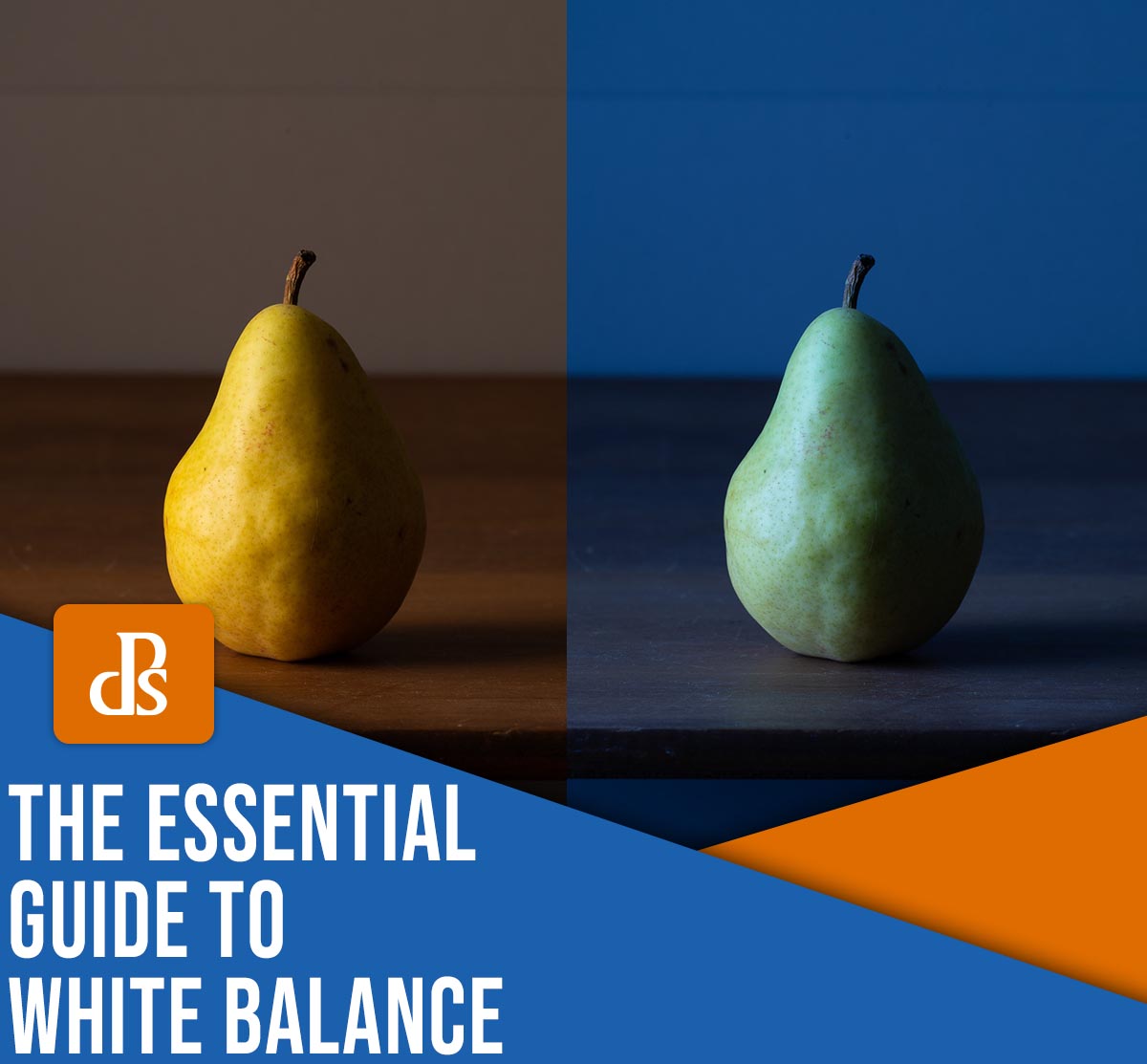
While HDR photography is a perfectly legitimate technique frequently used by professionals, it has unfortunately gained a negative reputation in many photography circles. When HDR first became popular, photographers often utilized the technique in an obvious and over-the-top manner. The resulting images appeared extremely unnatural, with grungy tones, excessive contrast, and an abundance of detail in the highlights and shadows. To make matters worse, these photos sometimes featured unpleasant artifacts such as halos and noise.
This tarnished the reputation of HDR photography as a whole. However, it’s crucial to recognize that there are many flavors of HDR editing, and it is very possible to use HDR processes to create images that accurately reflect what your eyes saw when you originally captured the shot.
Yes, it’s important not to take your HDR editing too far, but the good news is that modern post-processing programs excel at producing natural and realistic-looking results. Keep this in mind as you embark on your HDR editing journey, and you can easily avoid the pitfalls of the “bad HDR” look.
How to do HDR photography: step by step
In this section, I offer clear, step-by-step instructions for creating an HDR image, including both file capture and processing.
Step 1: Set up your camera
As I emphasized above, it’s important to keep your camera steady when shooting HDR, so if you’re planning to use HDR techniques, make sure you own a decent tripod.
Once you find a scene that could benefit from a high dynamic range treatment, mount your camera on your tripod and determine your composition (the way you would when capturing a normal, non-HDR shot).
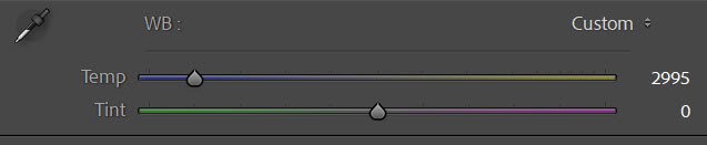
Then select your camera settings. First, adjust your camera mode to Manual; you don’t want the exposure changing from shot to shot.
Set your ISO at its lowest value to prevent noise, and choose an aperture that gets you your desired depth of field (I often shoot at f/8 to f/11, but you can go wider or narrower depending on your goals). Choose a shutter speed that gives you a balanced exposure (that is, make sure you expose for the midtones, not the highlights or the shadows). Here, it can help to look at your camera’s exposure bar, which is generally visible at the bottom of the viewfinder.
Switch your lens over to manual focus – you don’t want the point of focus changing between shots! – and adjust the focus ring until you get the result that you’re after.
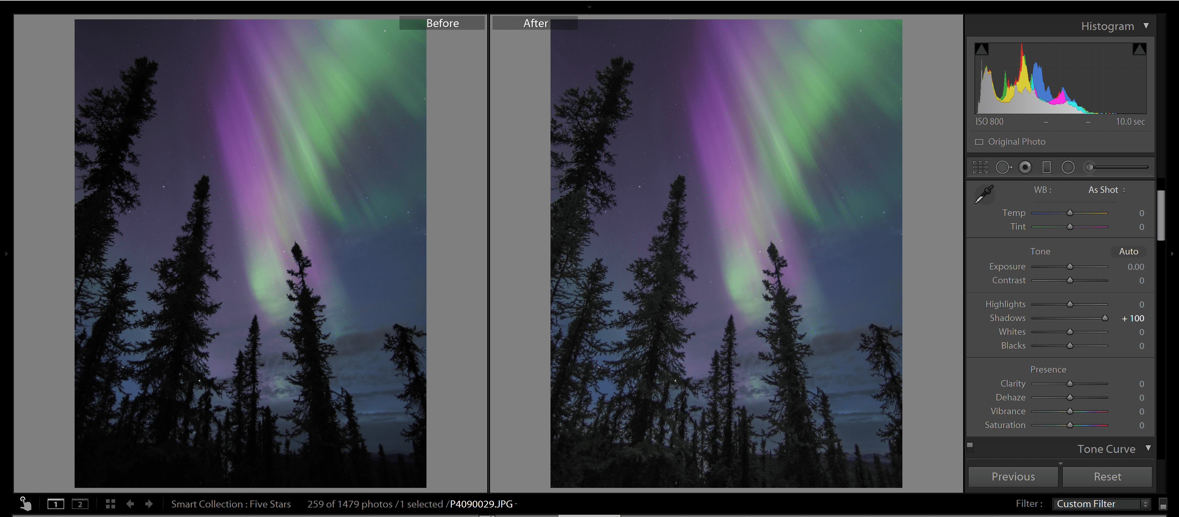
Step 2: Take a “correctly” exposed image
Once you’ve set up your shot, take one last look at your camera settings. If your shutter speed is below 1/60s or so, make sure you use your camera’s two-second timer or a remote release to prevent camera shake.
Finally, take your first shot. Review the results on the back of your LCD. The midtones should be well exposed, while the highlights and shadows are much less important.
If your image is very dark or very bright (i.e., exposed for the highlights or the shadows, respectively), I’d recommend adjusting your shutter speed and reshooting. Once you’ve successfully captured a file with detailed midtones, move on to the next step:
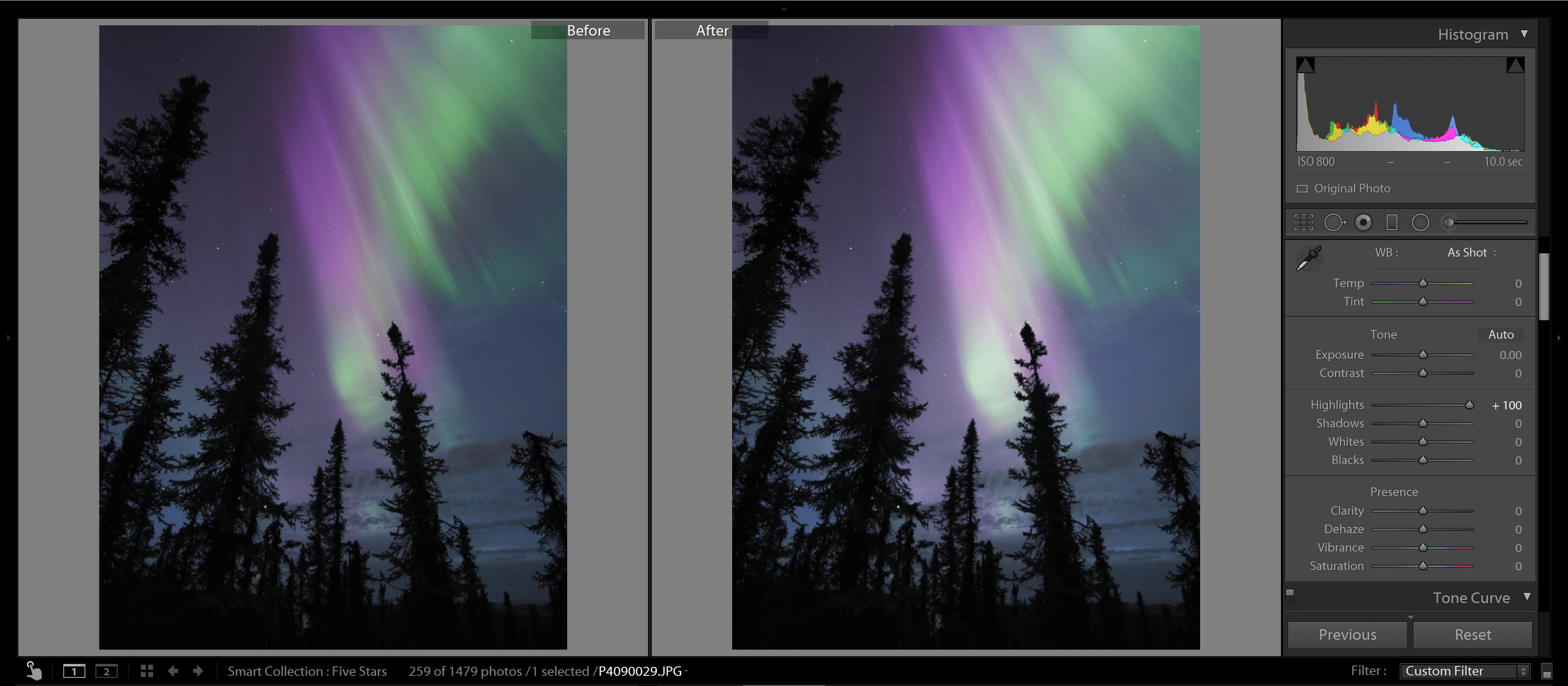
Step 3: Take an overexposed and an underexposed image
Keep your ISO, aperture, and point of focus consistent. Then reduce your shutter speed by a stop or two and take a photo.
The result should look overexposed, but the darker portions of the scene should feature plenty of detail. (You can check this on your LCD or your camera’s histogram.)
Next, raise your shutter speed several stops, then take a photo. This time, you should get an underexposed image, one that is missing lots of shadow detail but that accurately exposes the brightest parts of the scene.
Step 4: Consider the results (and take more photos if necessary)
At this point, you should have three photos: a standard (midtone) image, an overexposed image, and an underexposed image.
In many cases, this will be enough for a nice HDR blend, but if your scene features an extremely high dynamic range, you may want to shoot five photos, seven photos, or even nine photos. Simply keep adjusting the shutter speed for increasingly lighter and darker photos until you’re satisfied with your results.
Over time, you’ll get a sense of the number of shots you need to create a good HDR file, but I always recommend you review your images – and their corresponding histograms – on your LCD. If you find that you’ve captured sufficient detail across your sequence of photos, you can move on to the next step:
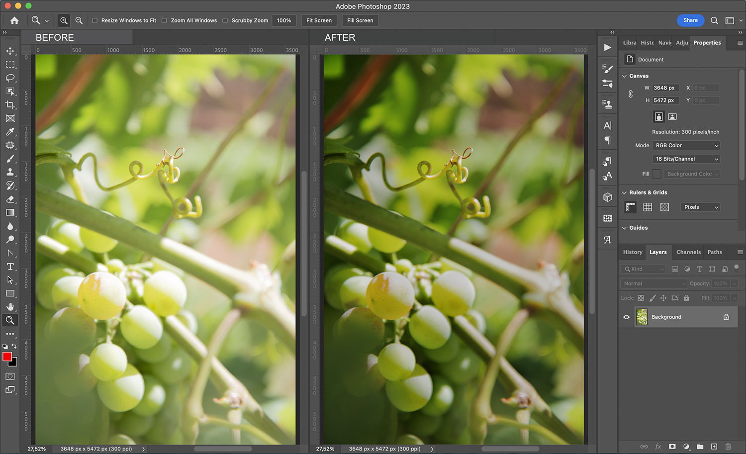
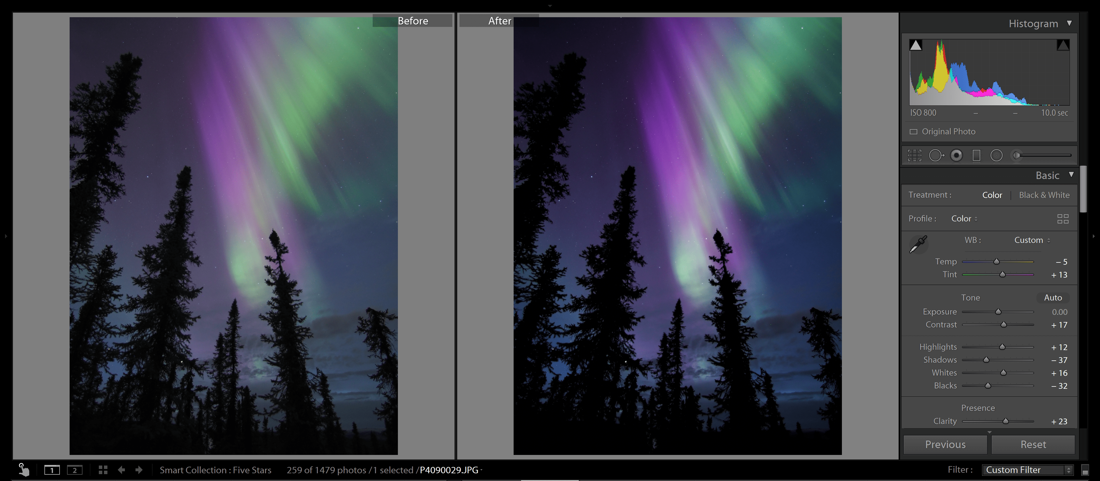
Step 5: Blend the files together
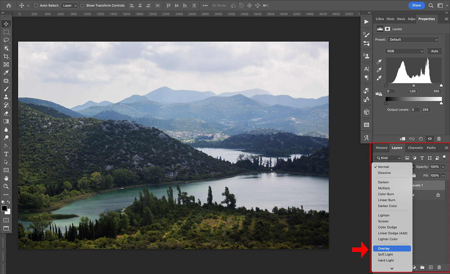
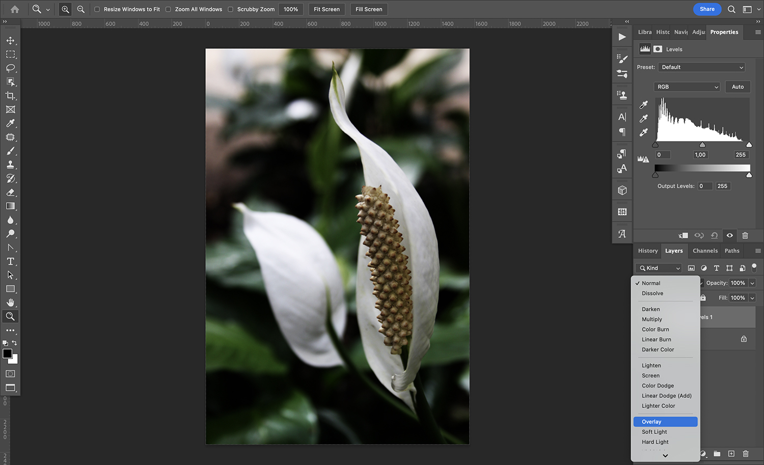
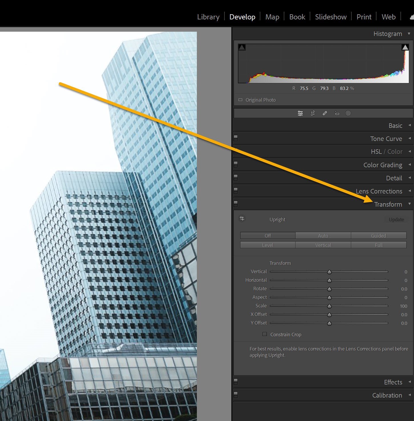
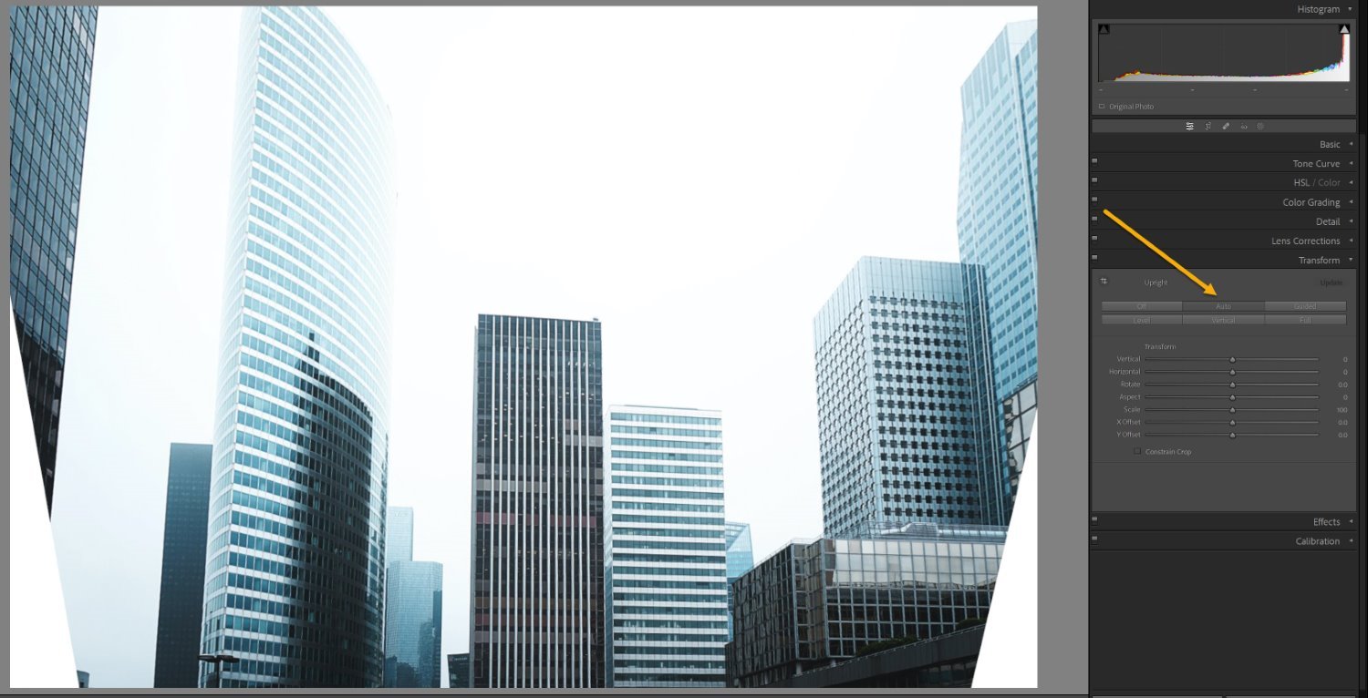
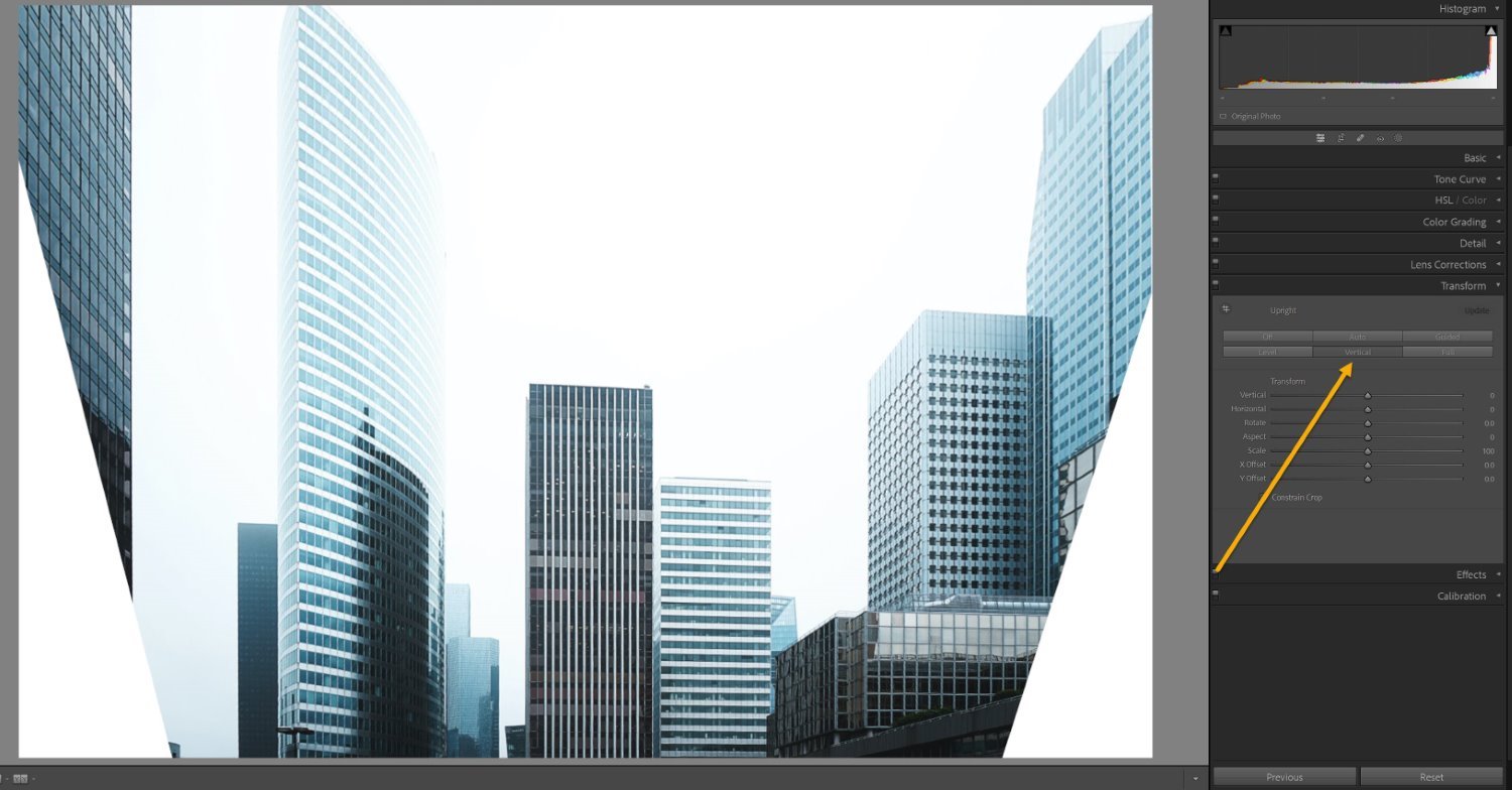
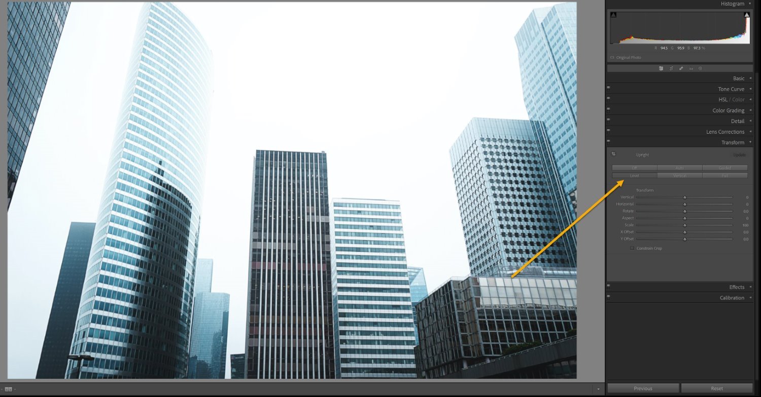
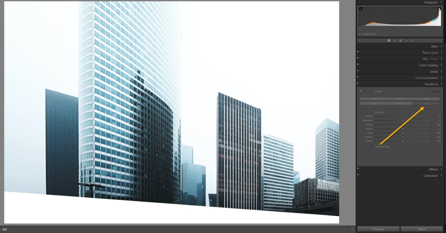
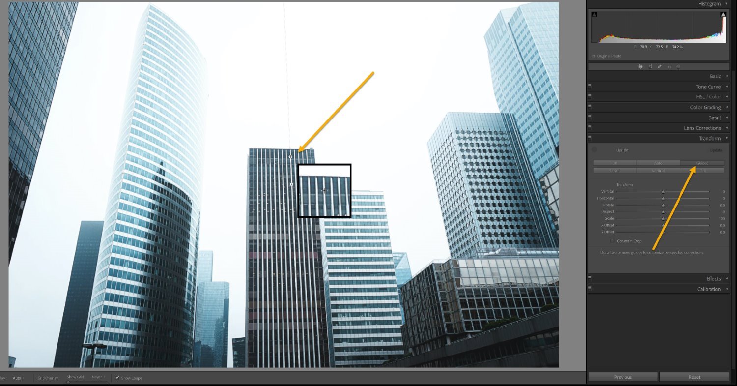
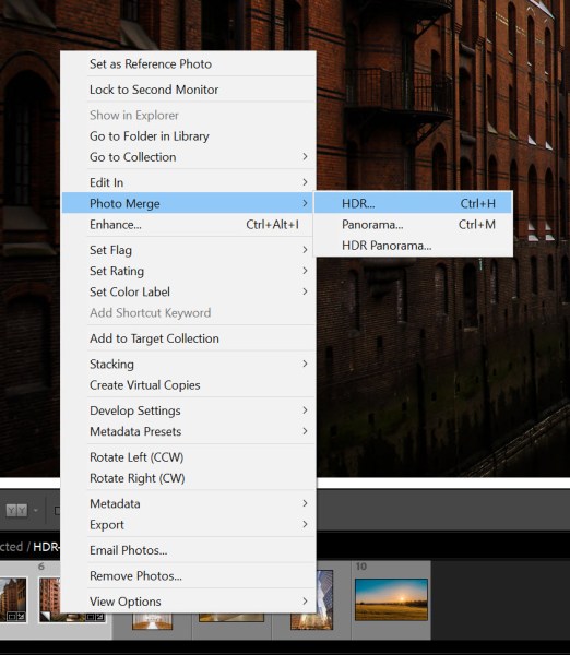
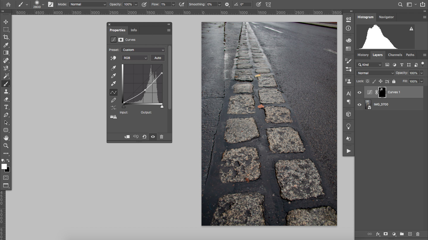
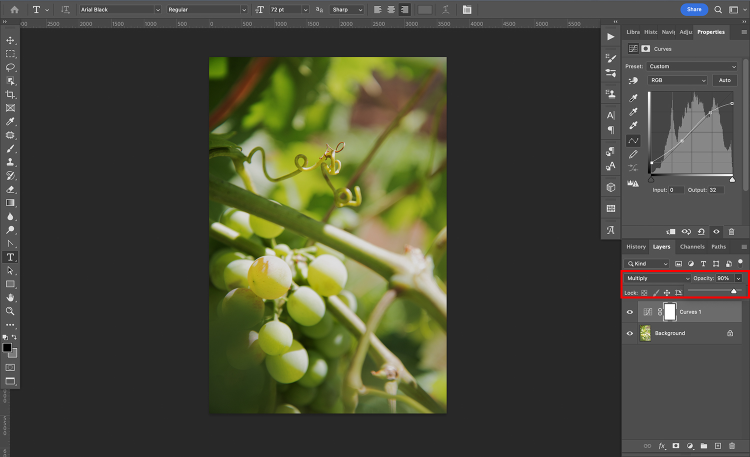
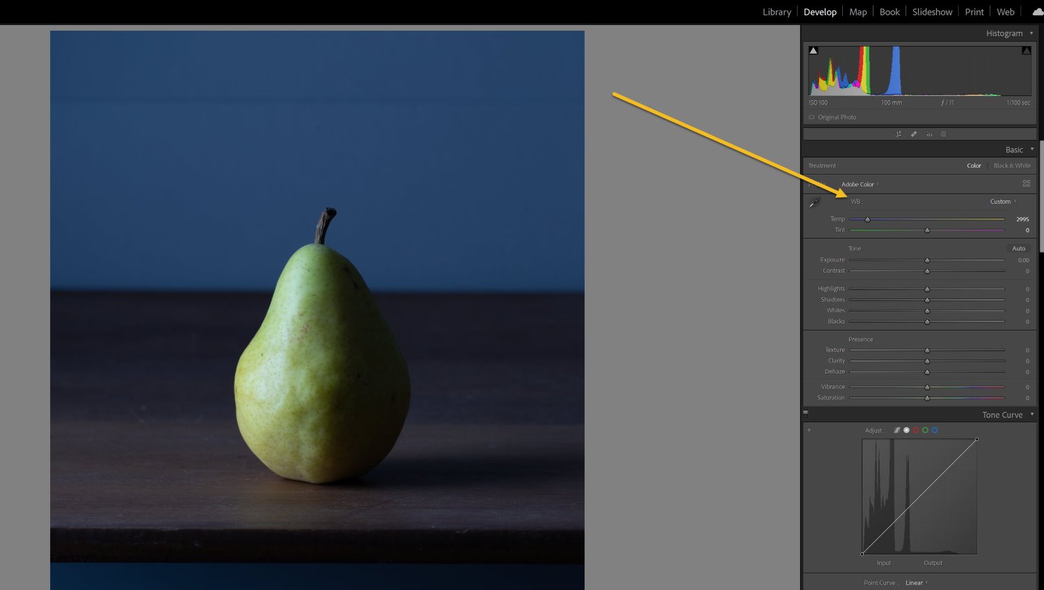
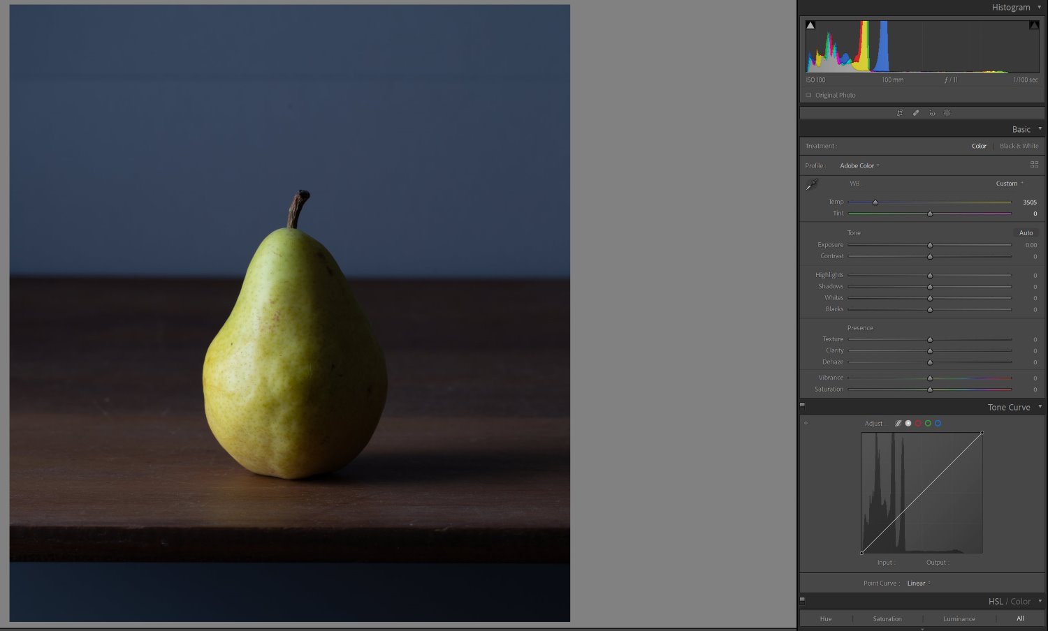
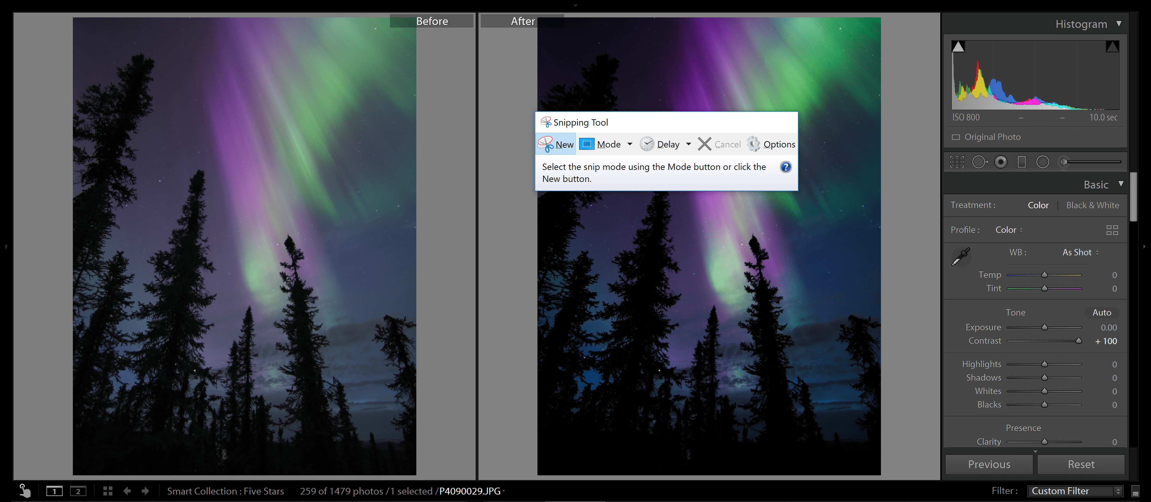
After an HDR shoot, you’ll need to blend the files together for a well-exposed composite image. The specifics will depend on your choice of post-processing software, but most programs make it pretty easy to create good-looking HDRs. Here’s how to create an HDR blend in Lightroom:
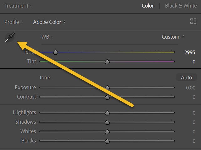
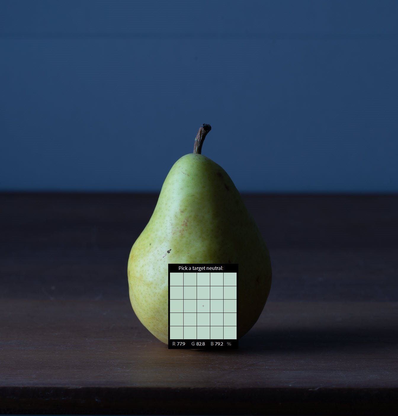
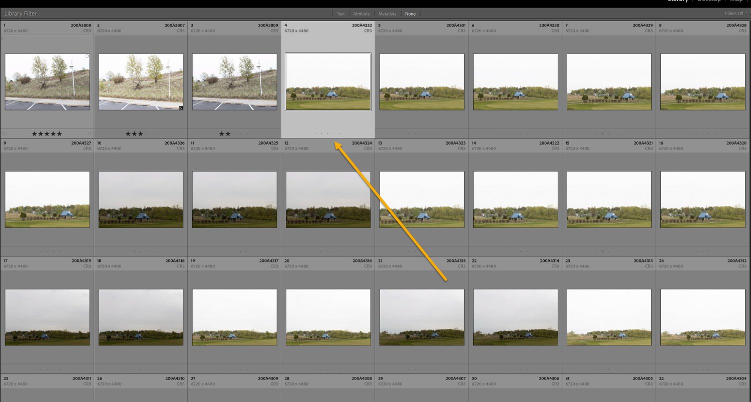
First, import your photos. Select all the files you need to blend together, then right-click and choose Photo>Photo Merge>HDR.
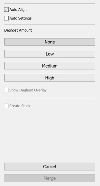
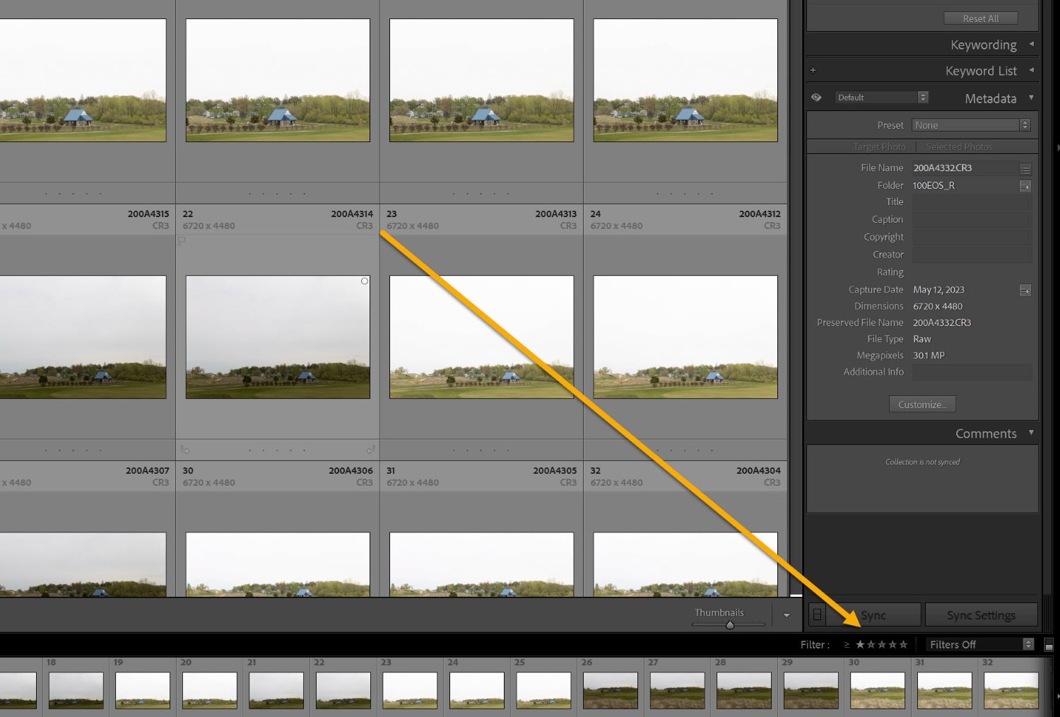
An HDR window will appear. I’d recommend checking the Auto Align box, especially if you shot handheld or your tripod moved from shot to shot. You can also check the Auto Settings box.
If your scene had moving elements (such as blowing branches or people walking), select the Medium or High deghosting option.
Finally, hit Merge, and wait while Lightroom processes your image! It might take a few seconds (or minutes, depending on your computer and the number of images you tried to blend), but you should soon see an HDR file appear.
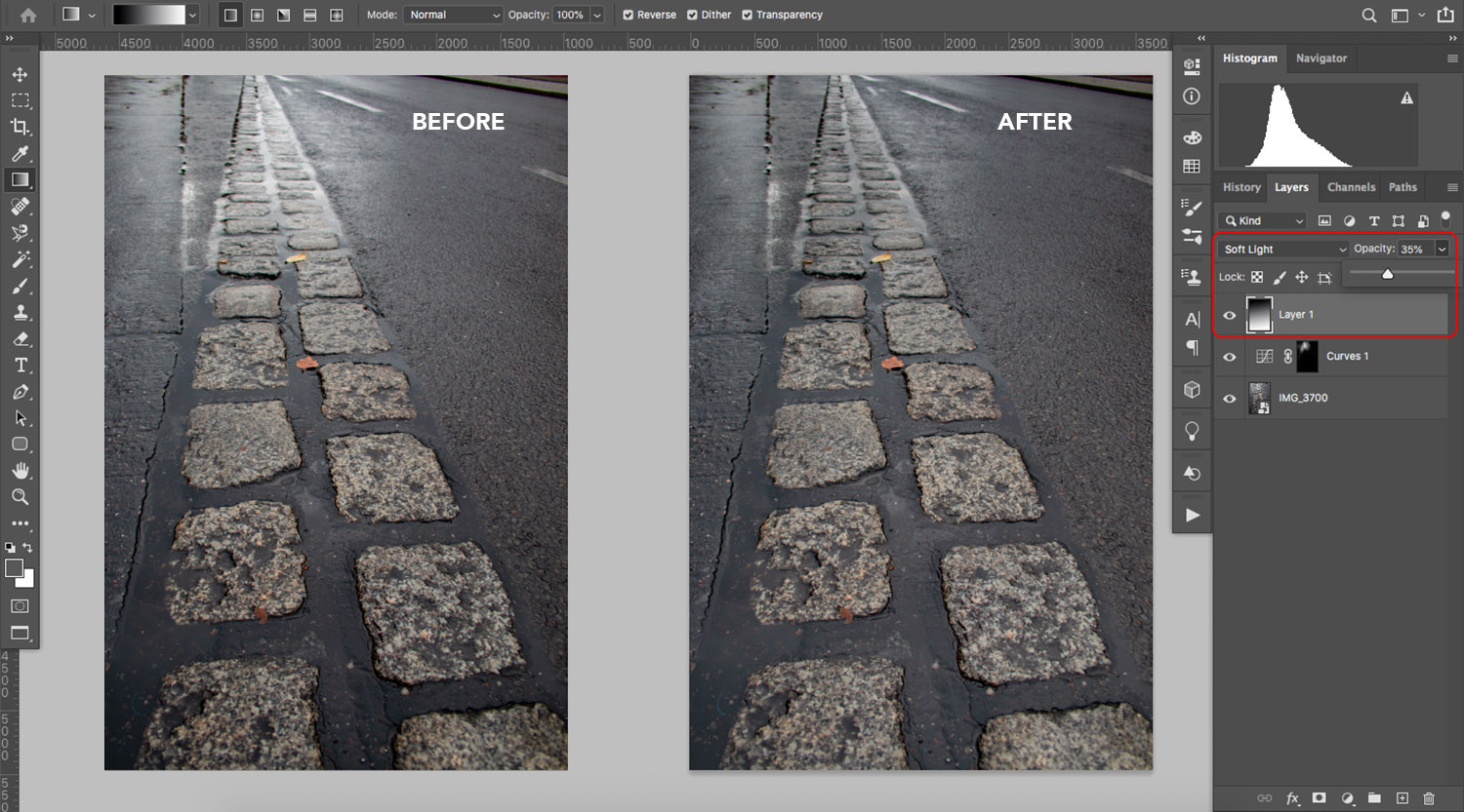
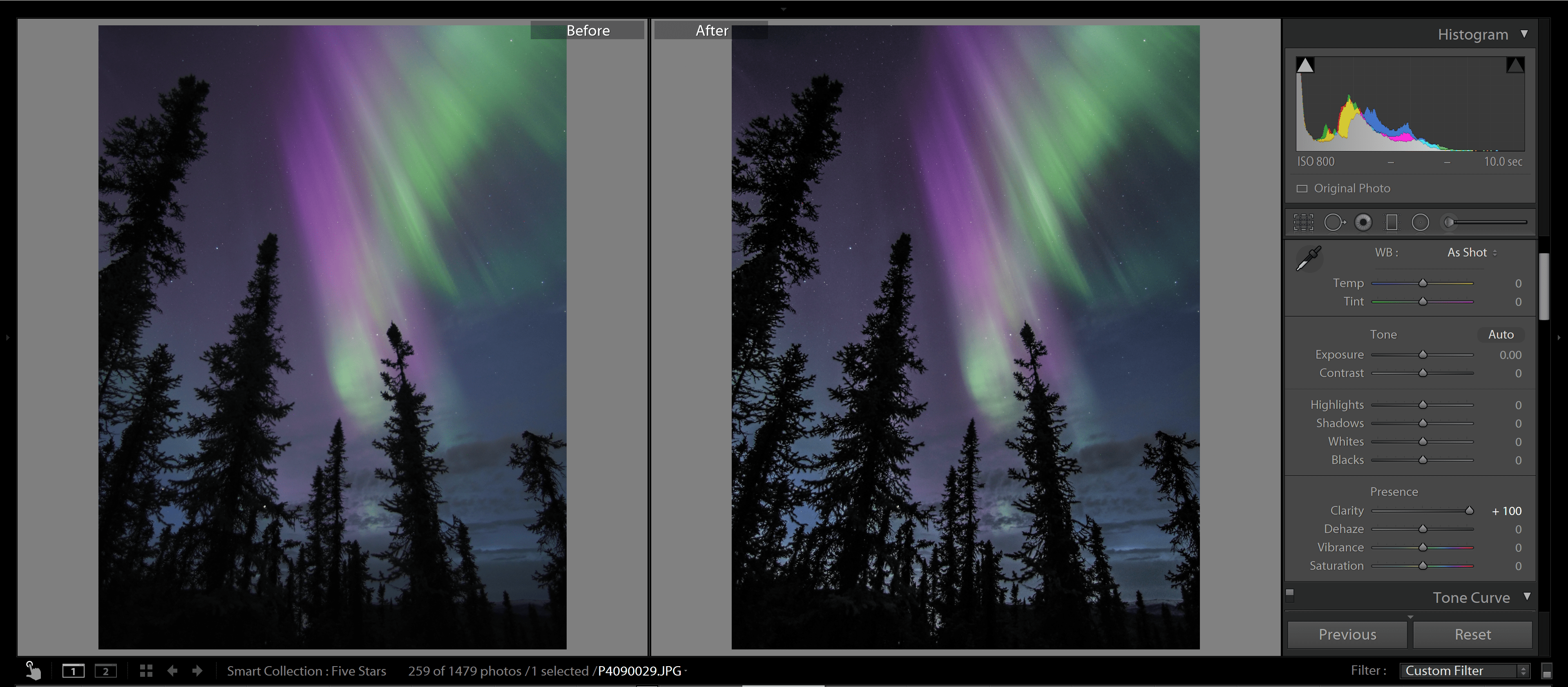
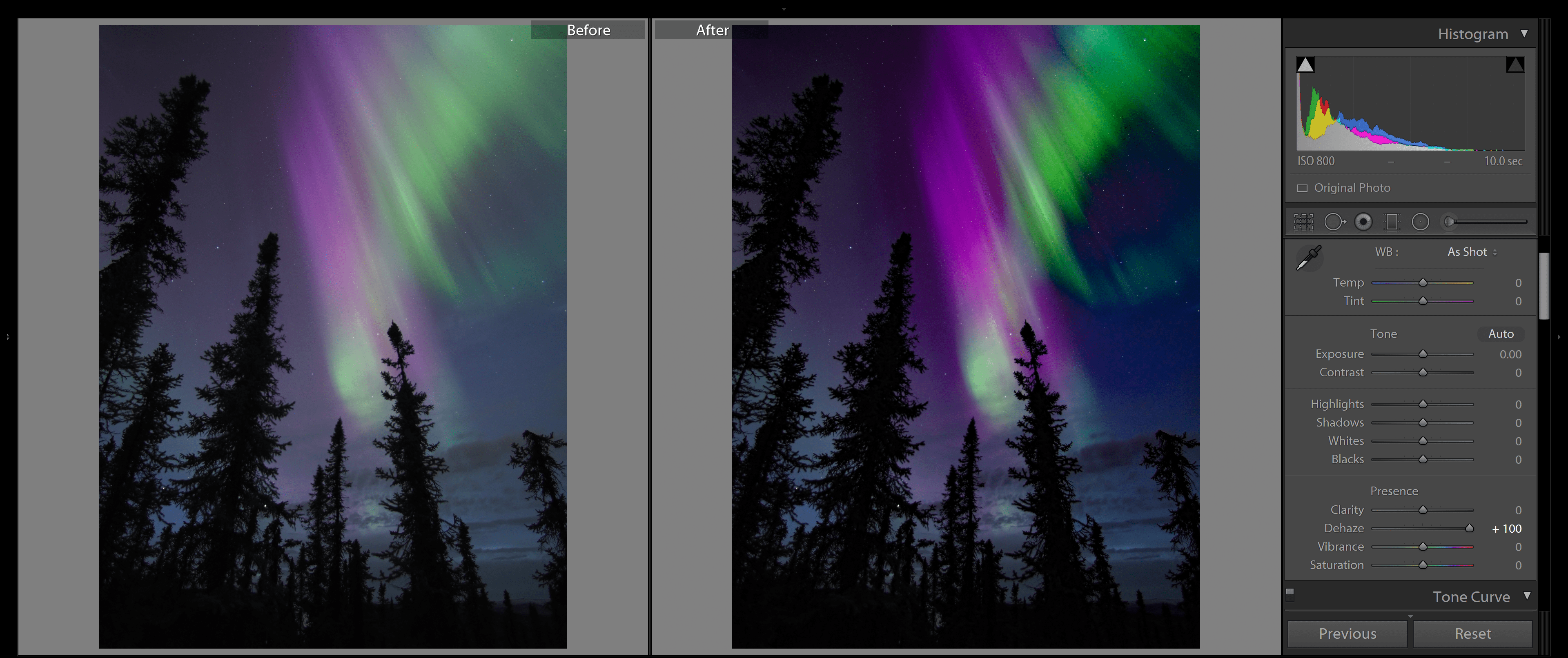
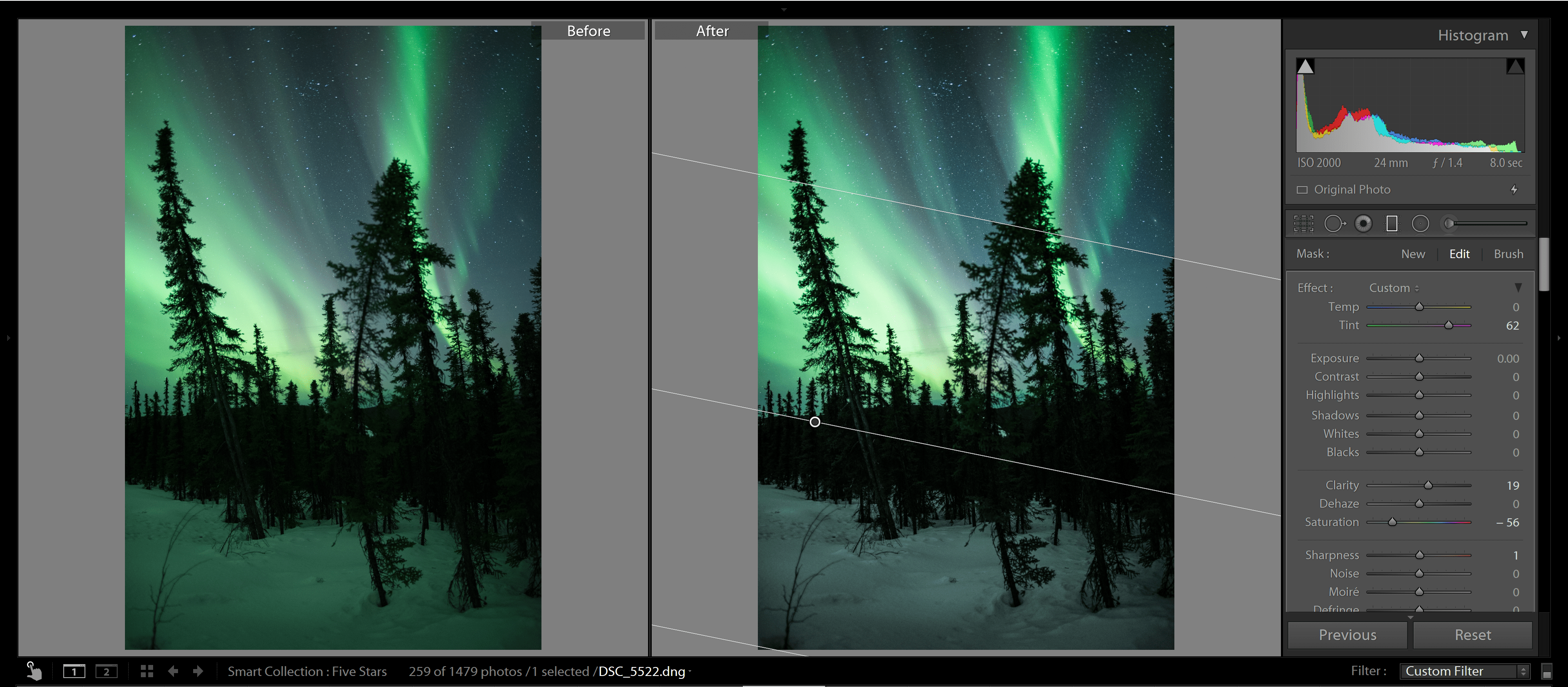
Step 6: Enhance your HDR file
At this point, you have a high dynamic range file, but what should you do with it?
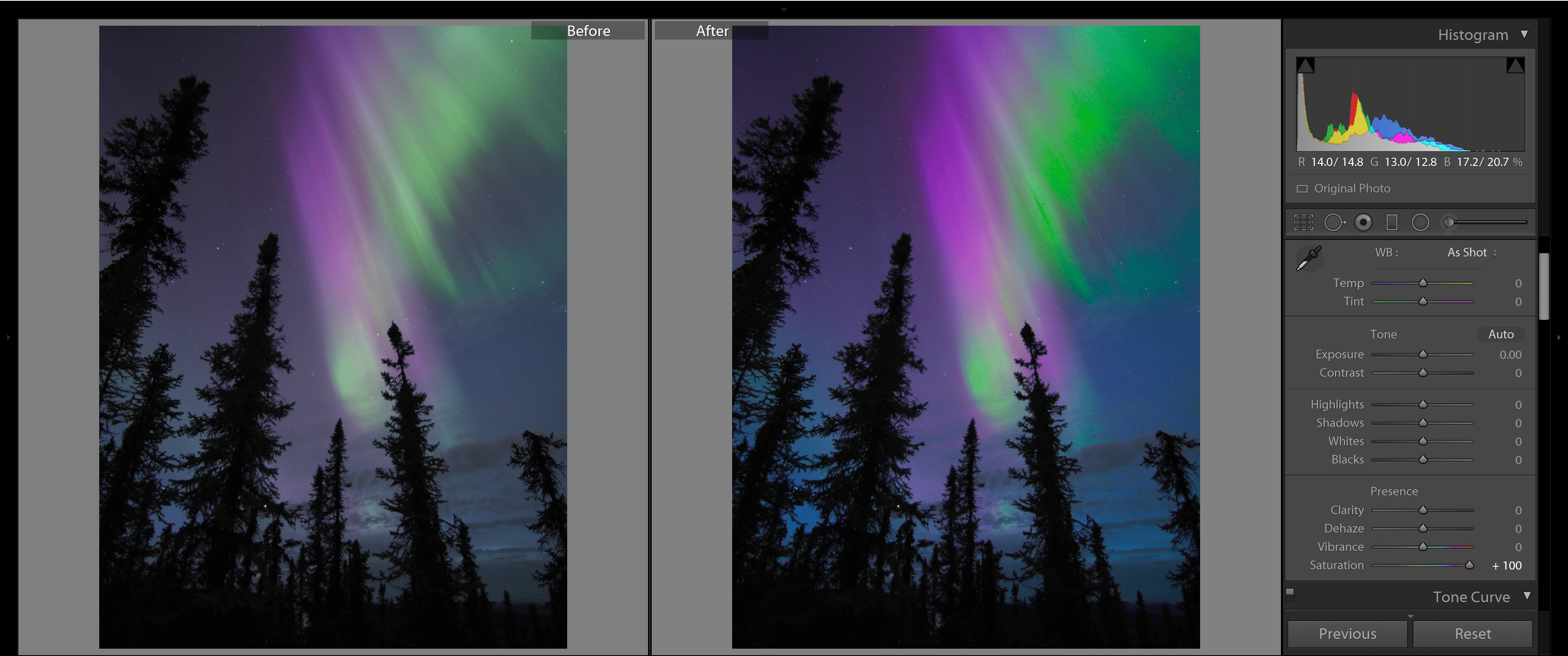
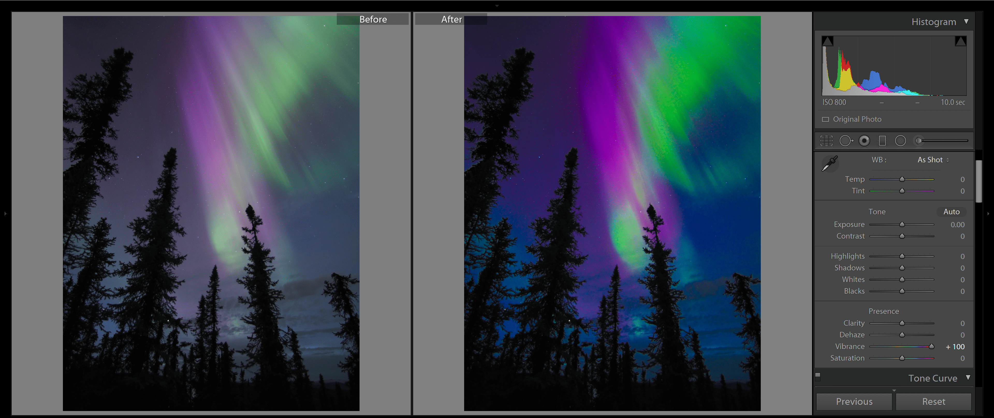
One option is to simply export it as a JPEG for sharing online, but I’d really recommend you first apply some additional post-processing. Tweak the exposure, the shadows, and the highlights; add (or subtract) contrast; add saturation and play around with color grading; and sharpen the shot as required. Then export it as a JPEG for viewing.
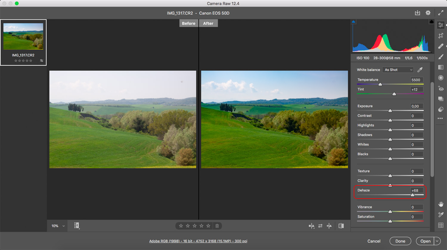
The best HDR software
If you’re serious about bringing out the full potential of your HDR images, using the right processing program is crucial. While I’ve explained how to process bracketed files in Lightroom as an example, there are several other fantastic options to consider.
For instance, Capture One, ON1 Photo RAW, and Photoshop are all comprehensive editing programs that include HDR blending capabilities alongside their normal features. The advantage of these programs is that you can incorporate the HDR merge into your standard workflow without needing to rely on a second editor, but the disadvantage is that they offer somewhat limited control over the blending process.
If you want more control, consider downloading a dedicated HDR program. Photomatix and HDR Efex are two prominent examples that offer advanced features specifically for HDR editing. With these programs, you can dive deeper into adjusting tones, merging exposures, and achieving the look you’re after.
While most HDR software comes at a cost, there are a few free options available, as well. Luminance HDR offers a range of features and is a great option for those who want to explore HDR photography without committing to a paid program.
At the end of the day, selecting the right HDR program largely depends on your personal preferences, workflow, editing goals, and budget. Experimenting with different options can help you find the one that resonates with your style and allows you to unleash your creative vision.
HDR camera modes
Some cameras offer dedicated HDR shooting modes. That way, you don’t have to do any manual bracketing or blending – you can set your camera to its HDR mode, press the shutter button, and end up with a fully merged HDR shot.
But before you jump on board, let me explain the pros and cons of relying on your camera’s HDR mode.
First, let’s talk about convenience. HDR camera modes can save you time and effort by automating the entire process. Gone are the days of meticulously capturing multiple shots and spending extra time blending them together during post-processing. With a simple click, you can capture a bracketed sequence, and the camera does the rest.
However, convenience often comes at a price, and HDR camera modes are no exception. One of the major drawbacks is the limited control over the process. While this varies depending on your camera model, you may find yourself unable to choose the number of bracketed shots, modify the bracketing intervals, or determine how the images are blended. This lack of control can be frustrating, especially for photographers who prefer a hands-on approach.
Another potential downside is the file format. Many cameras that offer HDR modes only create JPEG HDR files. While JPEGs are convenient and widely compatible, they lack the editing flexibility of RAW files. If you want to create the best possible results, I highly recommend working in RAW.
Considering these limitations, I generally advocate for manual HDR photography. Although it requires more effort, it grants you unparalleled control over the outcome. By manually capturing and blending your bracketed shots, you can carefully adjust each step of the process to achieve the desired result. The extra work is well worth the artistic freedom and control it provides!
Tips for creating breathtaking HDR images
Now that you’re familiar with the basics, let’s explore a few tips and tricks to elevate your HDR photos:
1. Choose your compositions carefully
As you may have already realized, creating an HDR image requires more effort than capturing a standard photo. It involves capturing multiple files and blending them together during post-processing. To make the most of your time and energy, it’s crucial to be deliberate in your shooting approach.
While it may be tempting to go trigger-happy and capture dozens of bracketed shots from every angle, I urge you to exercise restraint. Overloading yourself with excessive files will only lead to a daunting and time-consuming post-processing phase. Quality over quantity is the mantra here!
So instead of capturing HDR shots left and right, take a moment to pause and think about each scene. Work on identifying a single good composition, refining it, then capturing one sequence of bracketed files that you then blend together.
Of course, there may be instances when you find yourself torn between two slightly different compositions. In such cases, capturing multiple versions can be a good idea. However, strike a balance and avoid going overboard. The key is to maintain restraint in your shooting so that each shot is purposeful and intentional.
2. Explore manual exposure blending
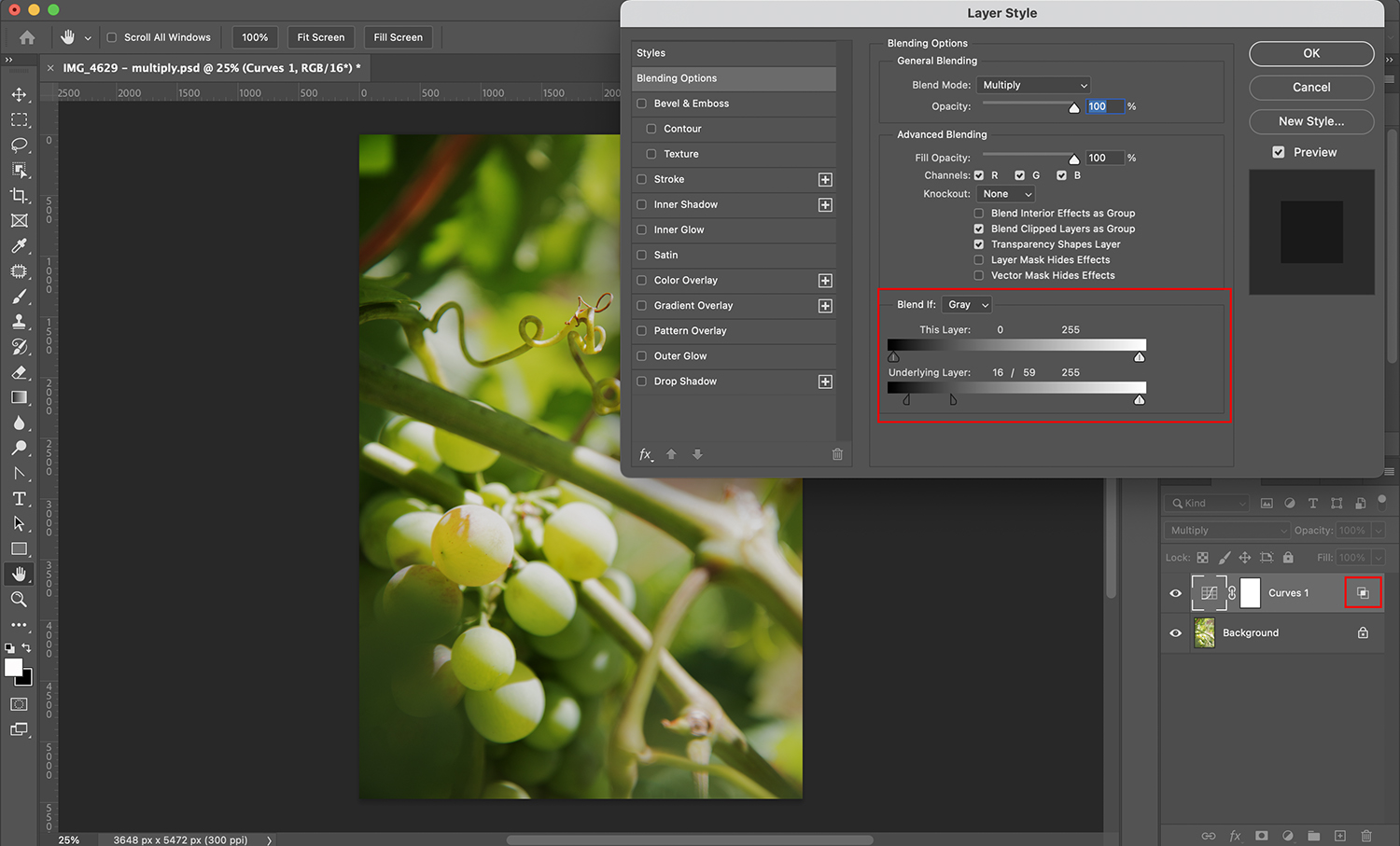
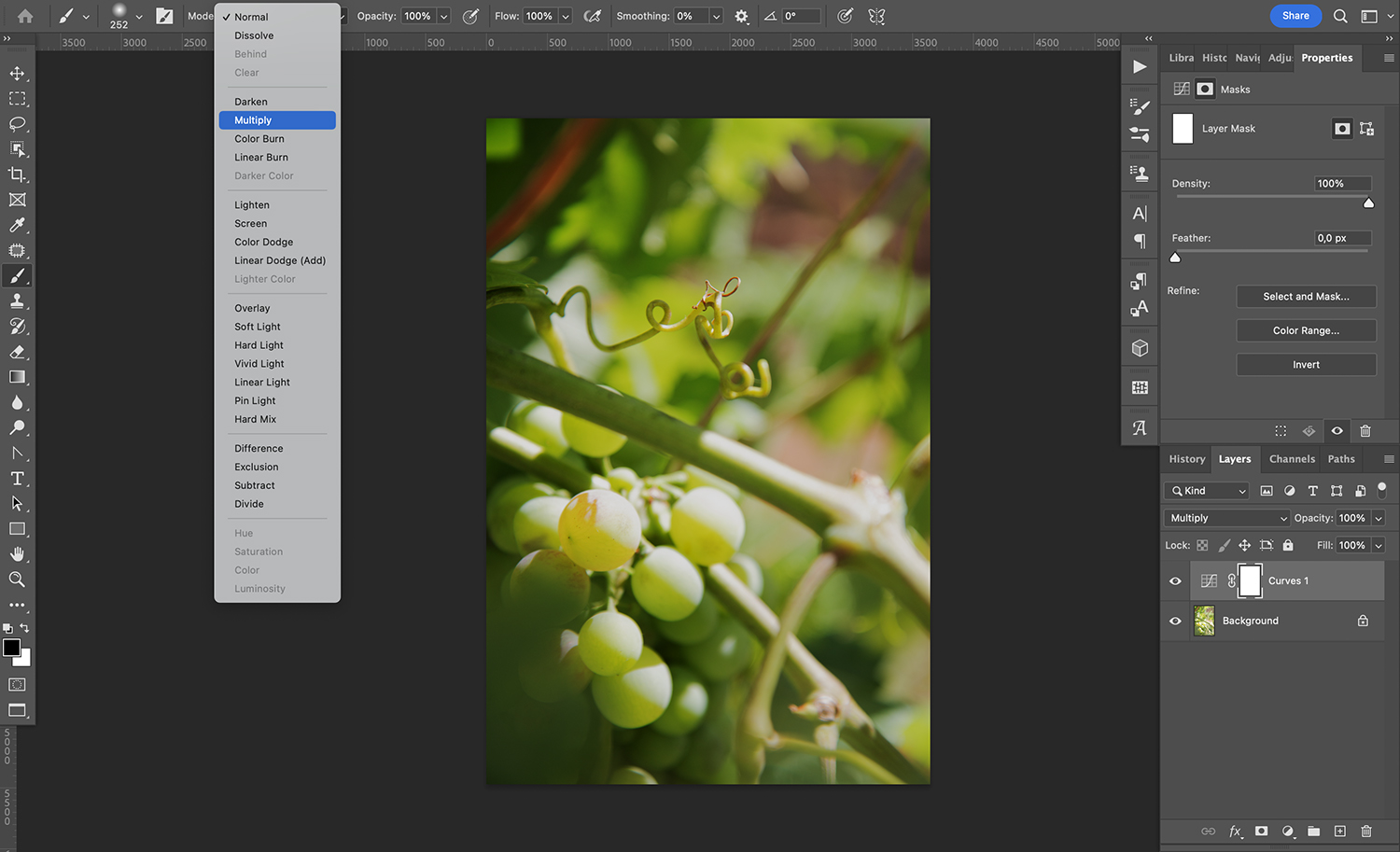
If you merge together your HDR shots using an automated process (like I did in my Lightroom example), the result is usually good. But it’ll occasionally look disappointing, or it’ll be decent but not up to your standards. That’s when you should consider delving into the world of manual exposure blending – a technique that allows you to craft stunning HDR images through careful fine-tuning and adjustment.
Manual exposure blending may sound intimidating, but it opens up a realm of possibilities and gives you the power to create truly exceptional results. By utilizing a process known as luminosity masking, you can blend different parts of each image based on their unique light and dark values. This level of precision empowers you to elevate your results like never before.
Now, I’ll say it upfront: Manual exposure blending isn’t a walk in the park. It requires some effort and has a real learning curve. However, if you do a lot of HDR shooting, it’s worth the effort. You probably won’t need it all the time, but it’s great to have in your back pocket for those times when your editing program struggles to create a nice blend.
3. Don’t be afraid of handheld HDR
While I’ve stressed the importance of using a tripod for capturing bracketed shots, I want to let you in on a little secret: It’s possible to achieve stunning handheld HDR images.
You simply need to capture your bracketed shots while keeping your camera as steady as possible. It helps to brace yourself against a solid object, like the ground, a car, or a tree, to minimize any camera movement.
Once you’ve captured your handheld photos, it’s time to bring them into your processing program. The good news is that most modern software is equipped with powerful algorithms that can align and merge the elements in each image, compensating for any slight movements you might have made.
However, it’s important to be aware that there are some trade-offs to consider. The more your camera moves between shots, the greater the chance of losing pixels around the edges of the frame because the program may need to crop in for alignment purposes. So it’s best to be as stable as possible during the handheld shooting process.
While shooting HDR images with a tripod is generally the superior option, there are times when circumstances prevent you from using one. In those situations, don’t hesitate to try the handheld approach. You might be surprised by the results!
HDR photography: final words
Congratulations – you’ve made it to the end of our ultimate guide to HDR photography! Now that you know how to use this powerful technique, it’s time to unleash your creativity and take your images to a whole new level.
Remember, HDR photography isn’t just about merging exposures and adjusting sliders. It’s an art form that requires careful composition, thoughtful shooting, and skillful post-processing. Make sure you work hard, push the boundaries, and see what you can produce.
So head out with your camera. Practice your bracketing. And create some HDR magic!
Now over to you:
Do you have any HDR tips or techniques that we missed? Share your thoughts in the comments below!
HDR Imaging FAQ
What does “HDR” stand for in photography?“HDR” stands for “high dynamic range.” It’s a technique that involves capturing and blending multiple exposures of the same scene to achieve a wider range of tonal details, from the darkest shadows to the brightest highlights. The result is an image that more closely resembles what the human eye can perceive in terms of dynamic range.
Should you always use HDR imaging?While HDR imaging can produce stunning results, it’s not necessary to use it for every photograph. HDR is particularly beneficial in high-contrast scenes where the camera struggles to capture details in both the shadows and highlights. So it’s best to assess each scene individually and decide if HDR is the right technique to achieve your desired outcome.
Do professional photographers use HDR?Absolutely! Professional photographers often utilize HDR techniques to capture and convey the full dynamic range of a scene in their images. However, it’s important to note that professionals use HDR judiciously and generally aim for natural-looking results, avoiding the exaggerated and over-processed look that has given HDR a bad reputation in some circles.
Is RAW or JPEG better for HDR?RAW files provide greater flexibility and control during post-processing. For instance, RAW files retain more tonal data, allowing you to recover details in both the shadows and highlights more effectively. However, some cameras offer HDR modes that create JPEG HDR photos. While this can be convenient, shooting in RAW gives you more latitude for adjustments and enhancements in the editing process.
Is HDR good for portraits?HDR isn’t typically the go-to technique for portraiture. However, there can be exceptions to this, such as when shooting environmental portraits with a wide dynamic range or when incorporating HDR as a creative choice for a specific portrait style.
What software is best for processing HDR files?There are several excellent software options for processing HDR files, each with its own strengths. Popular choices among photographers include Adobe Lightroom, Capture One, ON1 Photo RAW, and Photoshop. These comprehensive editing programs offer powerful tools and flexibility for merging and fine-tuning HDR images. Additionally, dedicated HDR programs such as Photomatix and HDR Efex provide specialized features and advanced control over the HDR process. Ultimately, the choice depends on your specific needs and preferences.
The post HDR Photography: A Step-By-Step Guide appeared first on Digital Photography School. It was authored by Barry J Brady.