Don't Miss this Simple Oft-Ignored Photo Masking Trick (VIDEO)

It’s not often that a helpful post-processing trick slips by Adobe impresario Matt Kloskowksi, and there’s a good chance that you may have missed it too. This technique isn’t exactly new but it’s quick, easy, very effective, and it’s takes barely five minutes to learn.

Matt says Photoshop and Lightroom can be way too complicated and “my personal mission is to create videos that simplify the process of shooting great photos and editing them for the results you’ve always wanted.” Speaking of masking, don’t forget to download Matt’s free Lightroom and Photoshop masking presets with a link in the description beneath the video.

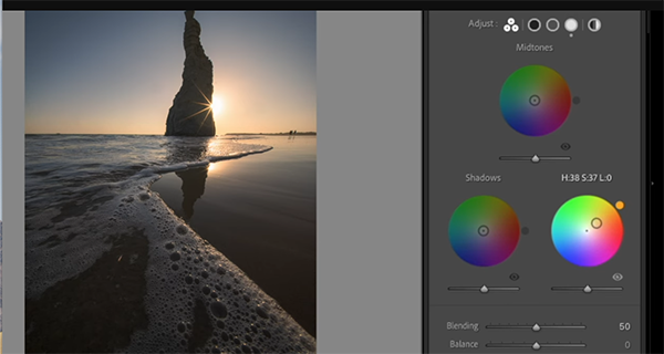
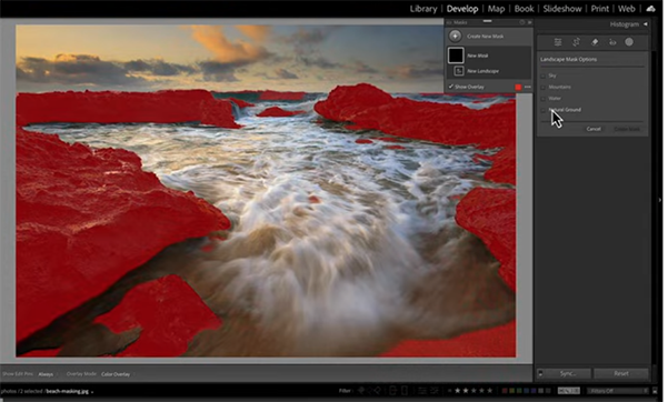
Today’s lesson begins in the Masking panel within Lightroom’s Develop module, but it works the same in Adobe Camera Raw (ACR). Matt acknowledges that this isn’t a trick you’ll employ for all of the photos you edit, and he explains why it’s specifically useful when employing any tools that automatically create masks for you, or when presets are part of your process.

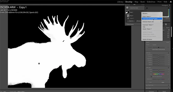
Matt uses the new auto landscape masks as his first example before moving on to people masks and others applications. His overview of today’s quick tip goes like this: “Let’s say you create a bunch of masks. What’s the software is going to do is create all possible masks for the type of image it detects.”

This doesn’t mean you’ll actually need every mask in the list which, in the case of landscapes, includes choices like Sky, Vegetation, Architecture, Artificial Ground, and others. But look closely and you’ll see a small exclamation point next some of the options in the dropdown list. This symbol identifies elements (and corresponding masks) that don’t exist for the specific image at hand.

You may think that leaving these unnecessary masks where they are doesn’t hurt anything, but Matt explains that they should be removed because they can actually slow down the editing process. The solution is following his simple instructions to select an option called Delete All Empty Masks from a pop-out menu.

Doing so is a great way “to keep things nice-and-tidy in your masking panel.” There are many more simple tips and techniques like this one on Matt’s instructional YouTube channel that has 128K interested subscribers.

And don’t miss an earlier tutorial we featured with five essential image-editing techniques that one of our favorite instructors says every landscape photographer must understand. There’s also an Editing Workflow Guide that you can download for FREE!

COLOR THEORY: Practical Real-World Tips for Better Photos (VIDEO)

Color theory is a universal language used by artists, filmmakers, designers, and well-informed photographers to imbue creations with their unique vision. The video below from expert Paul Kay explains why this essential concept should be top of mind whenever there’s a camera in your hand.

Kay is a successful travel photographer, popular instructor, and Sony Digital Imaging Ambassador based in Tokyo. He describes the topic of today’s important episode like this: “Learning how to use color theory in photography is such a great unlock for your compositional abilities.” In other words, it’s a fundamental consideration.

In barely 10 minutes Kay emphasizes several key color concepts you need to understand, and then he provides helpful graphics and real-word images to illustrate how to put your new-found knowledge to work. Along the way you’ll learn how the proper use of color “will help accentuate a subject, divert attention, and (my personal favorite) how to change the mood of a photo.”

Kay begins with an overview of the Color Wheel within which every color is represented. The trick when using this visual aid is understanding the manner in which colors are arranged. He explains that colors that oppose one another on the wheel are referred to as complimentary colors because “when they sit next to each other in an image they provide the highest amount of visual contrast. Because of that they work.”

Conversely, analogous colors sit together on the color wheel and are fanned out to display to display one main hue along with various gradations as you move to the left and the right. With the basics out of the way, Kay pulls up his first example—a stunning landscape scene captured in Kyoto with the sun setting behind a prominent pagoda and fading clouds overhead.

This shot is a perfect example of using color to accentuate a key subject with complimentary colors because if you time things right you can display beautiful blue and orange tones. Kay says, “I’m using orange as a brighter luminosity to pop out the pagoda and show viewers that it’s the star of my composition.”

As the lesson proceeds you’ll see different types of compelling photographs that rely upon color theory techniques to create magical effects that simply can’t be ignored. So pay close attention, change the manner in which you view the world around you, and take advantage of Kay’s practical advice the next time you’re out in the field.

There’s much more to see and learn on Kay’s instructional YouTube channel so be sure to pay a visit when you have time to explore.

On a related note, don’t miss an earlier tutorial we featured with a post-processing expert who demonstrates a straightforward Lightroom white-balance technique for creating photographs with “color separation” between your subject and the background of a scene.

Unistellar Odyssey Pro Smart Telescope Review: Fast, Fun, Easy, and Expensive

A split image: left side shows a black telescope on a tripod in front of green foliage; right side displays a detailed close-up photo of the Moon with cratered surface, labeled with coordinates and date.

The Odyssey Pro Smart Telescope is among Unistellar’s smallest and lightest reflector-based systems. It makes viewing and capturing the night sky as simple as clicking a few buttons on your smartphone or tablet. It is small, light, easy to travel with, and it has an actual viewfinder (powered by Nikon optics) allowing users to start viewing the night sky in less than five minutes.

[Read More]

Landscape Shooters: Do This with Boring Blue Sky Photos (VIDED)

Here’s a common scenario that many of us have faced on occasion: You travel to a distant location that you’ll likely never visit again and get totally skunked by the weather despite the numerous opportunities that abound. We not talking about rain or storms, but rather boring blue skies every single day.

Fortunately, there’s a straightforward post processing trick that will enable Lightroom users of all skill levels to transform these ho-hum images into attention-grabbing winners with the WOW factor. And that’s what instructor Nickolas Warner explains how to do in the next 10 minutes.

Warner is a globe-trotting pro who specializes in landscape and travel photography. He’s also a respected educator whose YouTube channel is designed to help others up their game in the field and behind the computer by gaining insight into how he shoots and processes his images in Photoshop and Lightroom.

Today’s example is a well-composed image captured at Sapat Beach in faraway Pakistan on one of those days that everyone loves—except for photographers, i.e. there’s nary a cloud in sight. He jumps into Lightroom’s Develop module by pressing the keyboard shortcut “D.” He next walks you through several preliminary adjustments that will help retrieve a bit of dynamic range.

Warner chooses the Adobe Neutral profile that he says is a good choice for images shot against the sun. Then he increases overall exposure, opens the shadows and blacks, and takes down those highlights. He also modifies contrast and brings up vibrance to recapture some of the color that was muted due to the Neutral profile in use.

At this point his base image is ready to go as soon as he eliminates a few distracting dust spots. Now it’s time for the meat of the tutorial—namely dealing with the bland sky—and Warner devotes the remainder of the video to demonstrating the simple step-by-step process. Compare his before/after images and you’ll be very impressed.

When the video concludes head over to Warner’s popular YouTube channel where there are many more interesting photo adventures and how-to videos to be found.

We also encourage you to watch the tutorial we featured with an accomplished Australian pro who reveals five essential post-processing tips that he says every landscape photographer should learn immediately.

Bird Photo Focus Tips for Shooting Through Branches (VIDEO)

We all love photographing birds, whether we’re shooting a local reserve, a nearby park, or even in the comfort of our backyard. Unfortunately, there’s a common focusing problem that occurs when the subject is perched among tree branches that can easily fool a camera’s AF system.

In the video below from expert Paul Miguel you’ll learn an effective solution for capturing sharp bird photos when distracting elements like branches or foliage make this difficult. He’s a professional wildlife photographer based in the UK, specializing in birds, with a popular YouTube channel dedicated to simplifying the process for beginner and novice shooters .

Miguel explains why a camera’s Focus-Tracking mode doesn’t get the job done, and why he recommends choosing the Spot Focus mode instead and how it can be used to pick out a bird through the branches. He admits that that this approach may fail when the cluster of branches is really thick, in which case you may think it’s time to select Manual focus instead.

But not so quick, because what if the bird suddenly moves to a less obstructed position where autofocus can be really helpful for nailing the shot? This is the reason for Miguel’s “hybrid” focusing technique that he demonstrates in the next seven minutes.

Miguel explains the process like this: “I temporarily lock the autofocus, grab the focus ring on my lens, and focus manually, and this works well if you’re using back-button focus.” Then if the bird moves to a less-cluttered spot it’s a simple matter to reengage autofocus and fire away.

As you’ll see, there are a few ways you can configure the camera appropriately depending upon your preferred method of shooting. Miguel urges you to be willing to experiment and accept the fact that there may be a few frustrating failed attempts, because there’s no doubt that these situations can be a hit-or-miss affair.

That said, your odds of success will increase dramatically by taking the aforementioned hybrid approach and understanding the specific details you’ll learn as this episode unfolds. Then head over to Miguel’s instructional YouTube channel and consider joining his 43K enthusiastic subscribers.

And be sure not to miss the earlier tutorial we featured with an Australian pro who insists that shutter speed is your camera’s most power exposure option for capturing unique photographs with a creative flair.

5 Top Editing Tips for All Landscape Photographers: Download the FREE Guide! (VIDEO)

Don’t be fooled by the brevity of this tutorial from instructor Steve Arnold because he insists that his handful of editing tips are essential for every landscape photographer to understand. He says he was unaware of all five techniques when first getting started with post processing, and the quality of his work suffered as a result.

Arnold says what you’ll learn below will significantly shorten you image-editing learning curve, and there’s a big promise attached to his straightforward tips: “Each one on its own can make a massive difference, but if you do all of them it will be a total gamechanger for your photography.”

Tip #1 is critically important for everyone who wants to achieve consistent results from on edit to another. As Arnold puts it, “there’s nothing worse than knocking it out of the park one minute and then being very disappointed at how your next photo turns out.” The solution to this common dilemma is to create a sequential “blueprint” that you adhere to whenever opening an image in Lightroom or Photoshop.

As you’ll see, there are two important consideration to keep in mind. The first, is that the most effective workflow is one in which you apply certain tools in a specific order. So when processing a series of images with a similar look you should “make the same editing decisions in the same order every time you’re about to begin.”

Next on the agenda is a process for rehabilitating images of colorful scenes that turn out flat and uninspiring. One solution before getting  too far along with adjustments is to compare how a shot appears in both color and b&w—even if you intend to display the final result in color. Arnold explains what to look for when making this comparison, but it boils down to this: “If the Light doesn’t look good in black-and-white, then it probably doesn’t look great in color.”

Arnold demonstrates three more powerful post-processing tips as the video proceeds, and you’ll want to add all five to your everyday workflow. Make sure to take advantage of his FREE Editing Workflow Guide using the link in the description beneath the video to download your  copy.

And don’t forget to check out his instructional YouTube channel which has over 53K enthusiastic subscribers.

Speaking of Lightroom techniques for landscape photographers, the tool you’ve been awaiting is finally here. So take a look at the recent tutorial we shared explaining exactly how it works.

A Quick White Balance Trick for Photos with Ideal Colors (VIDEO)

Experienced Lightroom users understand why using local adjustments to control white balance can be one of the best ways to enhance colors in an image while maintaining a realistic look. And today’s tutorial from pro Austin James Jackson provides a quick-and-effective method for getting the job done to perfection.

Jackson is a Utah based professional landscape photographer and an exceptional instructor whose weekly editing and in-the-field lessons are guaranteed to help you create more compelling images. Today’s Lightroom tutorial is all about enhancing color for creating natural-looking photos that pop off the screen.

You’ll learn (once again) why we’re strong proponents of selective enhancements rather that limiting your edits to global adjustments that affect the entire image at once. Jackson puts it like this: “While a global white balance adjustment can neutralize colors in an image, you’re often missing out on an opportunity to add drama and mood while creating color separation between the subject and background.”

In other words white balance can be one of the most important settings if done right but doing things wrong can spoil a potentially great shot. Jackson reveals the transformational power of color separation while working on a tight shot of a moose captured at the long end of a 150—600mm telephoto zoom at ISO 800.

The original shot looks pretty good, but Jackson is unhappy with how the color of his subject sort of blends into the background. But watch what happens when he applies his white balance trick that takes less than eight minutes to explain. There’s a bit of snow on the moose’s back which is why Jackson wants to retain the warm look of his subject but cool off the background for a more wintery effect.

Jackson’s goal is difficult or impossible to achieve with a “lazy” global approach to processing the image. The foregoing is a leadup to how adjusting white balance selectively to different areas within the frame is a foolproof solution. He walks you through every step of the way, and you’ll quickly realize how useful this technique can be for balancing colors in other types of photographs.

Jackson’s popular YouTube channel is a great source of shooting and editing how-to videos, so be sure to take a look when you have time to explore.

And don’t miss the related Lightroom tutorial we featured recently with another accomplished pro who demonstrates why and how to set the white and black points during post-processing to create outdoor photographs with accurate tones.

Why Shutter Speed is the Most Creative Option in Your Camera (VIDEO)

We spend a lot of time discussing why your camera’s Aperture Priority mode is so powerful, and why it’s the choice of many pros. But this tutorial from the Newcastle Photography College takes a contrarian view when it comes to boosting the creativity of your images.

Today’s unnamed instructor is an accomplished Australian outdoor shooter with over 40 years of experience and some great imagery to back it up. He says, “I know what works and what doesn’t, the myths and misconceptions that are spread about photography, and want to pass on my knowledge to you.”

The video begins with a bold and emphatic claim that your shutter speed is the most creative option you have on your camera. He insists that taking this approach “allows you to produce images that just aren’t possible any other way.” In barely eight minutes he walks you through a variety of situations, illustrated with attention-grabbing photos, to convince you to take this advice to heart.

Embracing the possibilities will enable you to use fast shutter speeds to freeze the peak of action and slow speeds to convey a sense of motion. You’ll also even learn how to combine simple flash with a slow shutter to create beautiful images with an unusual eye-catching effect. The good news is that these techniques are appropriate for beginners and more experienced shooters alike.

And there’s another surprise when our instructor explains how much he dislikes the popular Exposure Triangle and why he ignores it for many different reasons. “One is that it tends to give the impression that all of the brightness controls (aperture, ISO, and shutter speed) are of equal value. They’re NOT.”

There’s a brief overview of how shutter speed combines with other key variables to arrive at an accurate exposure, but you’ll see why there’s way more than that to this essential setting, whether you’re shooting environment portraits, wildlife subjects, people on the street, sports photos and more.

“Bottom line: “here are 10 options you can use with your shutter speed to create images that you thought were impossible.” And these inspiring examples are all accessible with whatever gear you own if you choose the appropriate setting for whatever look you have in mind.

Once you’re done watching head over to the Newcastle Photography College YouTube channel where there are many more thought-provoking instructional videos to be found.

And don’t miss the tutorial we featured recently with another successful pro who demonstrates how he emphasizes contrast to strengthen highlights and shadows for outdoor photographs with a maximum range of tones from bright whites to deep blacks and everything in between.