Multiply Blend Mode: A Comprehensive Guide

The post Multiply Blend Mode: A Comprehensive Guide appeared first on Digital Photography School. It was authored by Ana Mireles.

Multiply Blend Mode: A Comprehensive Guide

Multiply is one of Photoshop’s most popular blend modes. If you’ve ever followed the steps in a Photoshop editing tutorial, you’ve probably used it yourself, and if you’ve ever watched a Photoshop expert apply edits to their work, you’ve probably seen it in action.

But why is Multiply so common? What makes it such a popular choice among Photoshop artists and photographers? It’s because the Multiply blend mode is very versatile; it can be used to create all sorts of interesting effects.

In this article, I offer a comprehensive overview of Photoshop’s Multiply blend mode. I discuss what it is and how you can use it, plus I offer a step-by-step tutorial so you can see it in action.

Let’s dive right in.

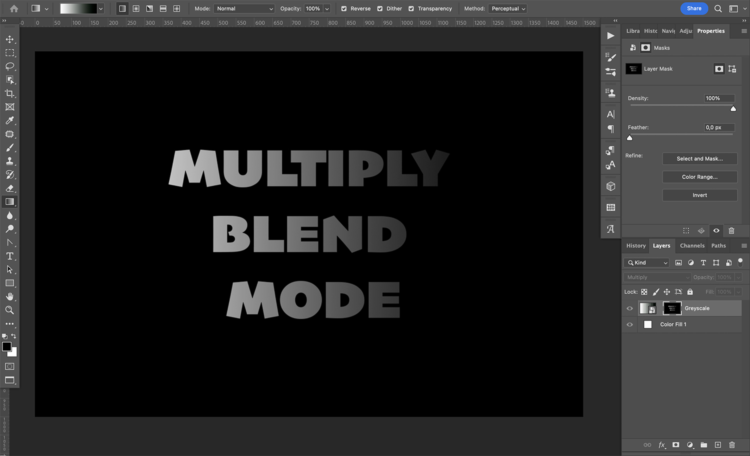
What is Multiply blend mode?

Multiply blend mode

As you probably know, Photoshop allows you to work with layers. And on each layer, you can put different elements: text, an image, an adjustment, and so on.

Now, Photoshop’s blending modes allow you to change how a layer interacts with the layers underneath. The blending modes are divided into categories (you’ll see a line dividing each category in the blending mode menu).

One of these blending mode categories is Darken, which includes the mode featured in this article, Multiply. As the name of the category suggests, by applying a Darken blend mode, you darken the overall file.

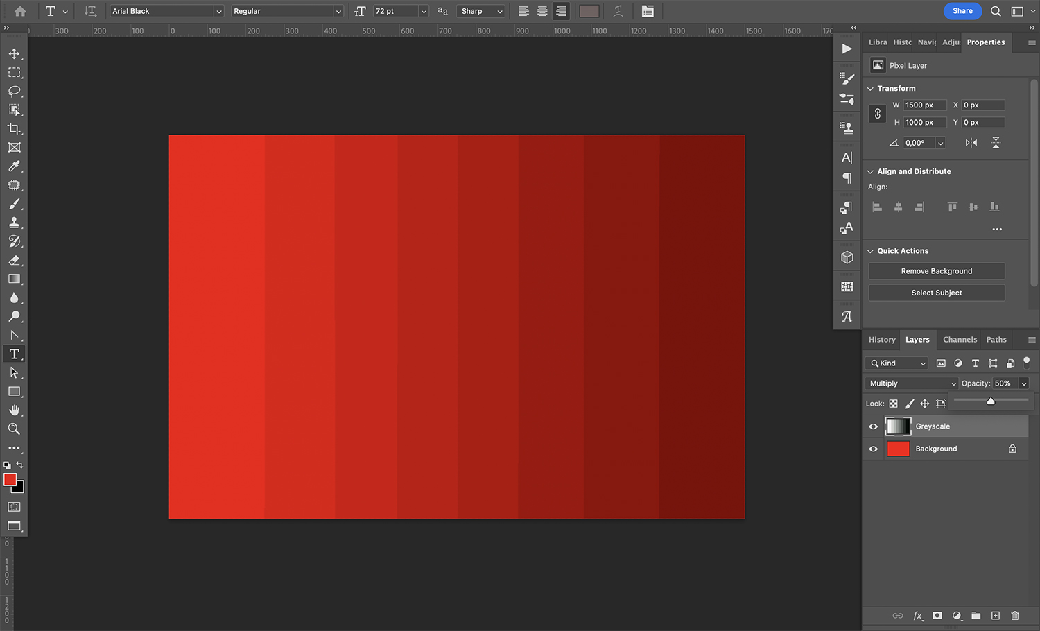
In the case of Multiply, the image is darkened by multiplying (hence the name) the color values from one layer by the layers underneath.

Don’t worry about the math, though. Photoshop takes care of that! What you need to know is that multiplying any layer by a black layer will create a black image, and that multiplying any layer by a white layer will cause the white layer to disappear. However, if you multiply a midtone layer by another midtone layer, you’ll end up with a combination of the two layers – but as darker versions of themselves.

When should you use Multiply blend mode?

The answer to this question is very straightforward: You should use Multiply blend mode when you want to darken your image.

What does this mean in practical terms? Here are a few common cases in which you might apply Multiply:

  • When you want to recover faded color from vintage photographs
  • When you’re fixing an overexposed image
  • When you want to include a shadow on a cutout
  • When you want to color under a traced drawing so that the lines remain black

Of course, there are plenty of other uses for Multiply, so don’t feel restricted by my list; these are just some scenarios to keep in mind.

How to use Multiply blend mode

The Multiply blend mode is very easy to use! Here’s how it works:

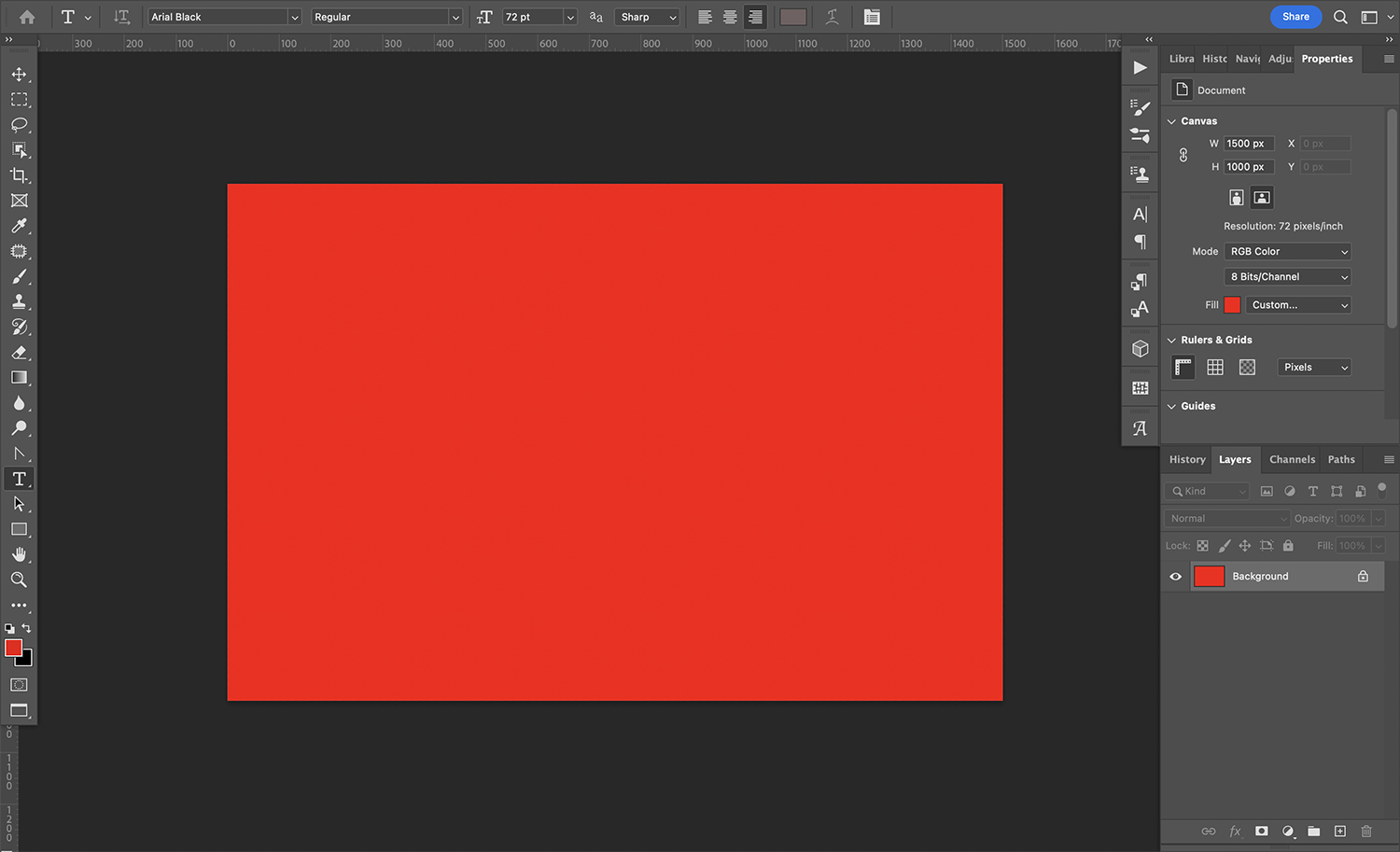
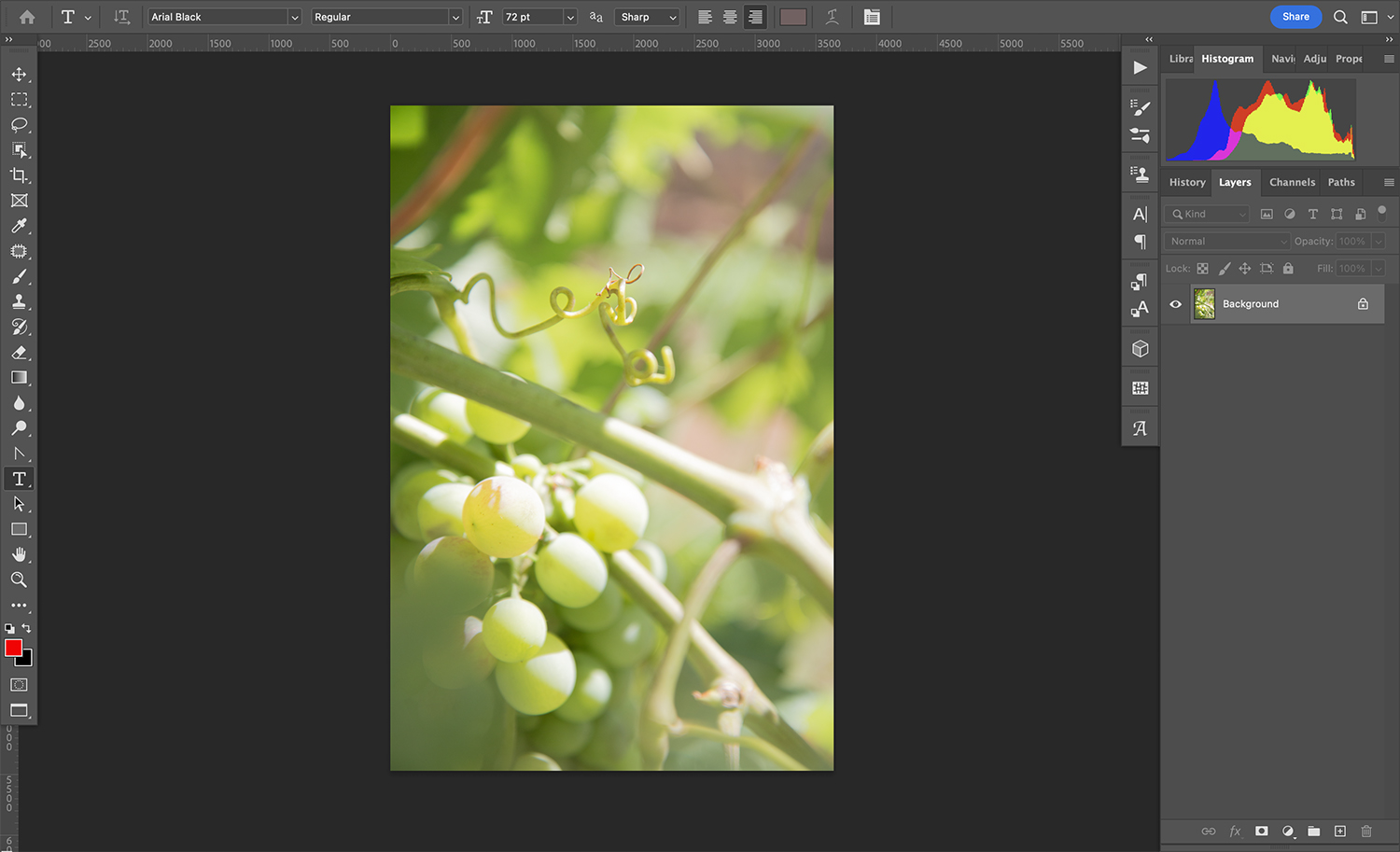
First, open any image in Photoshop. It’ll become the base layer (by default, it’ll appear as a locked layer called “Background”).

Multiply blend mode

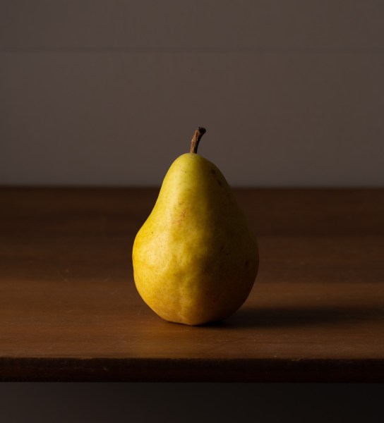
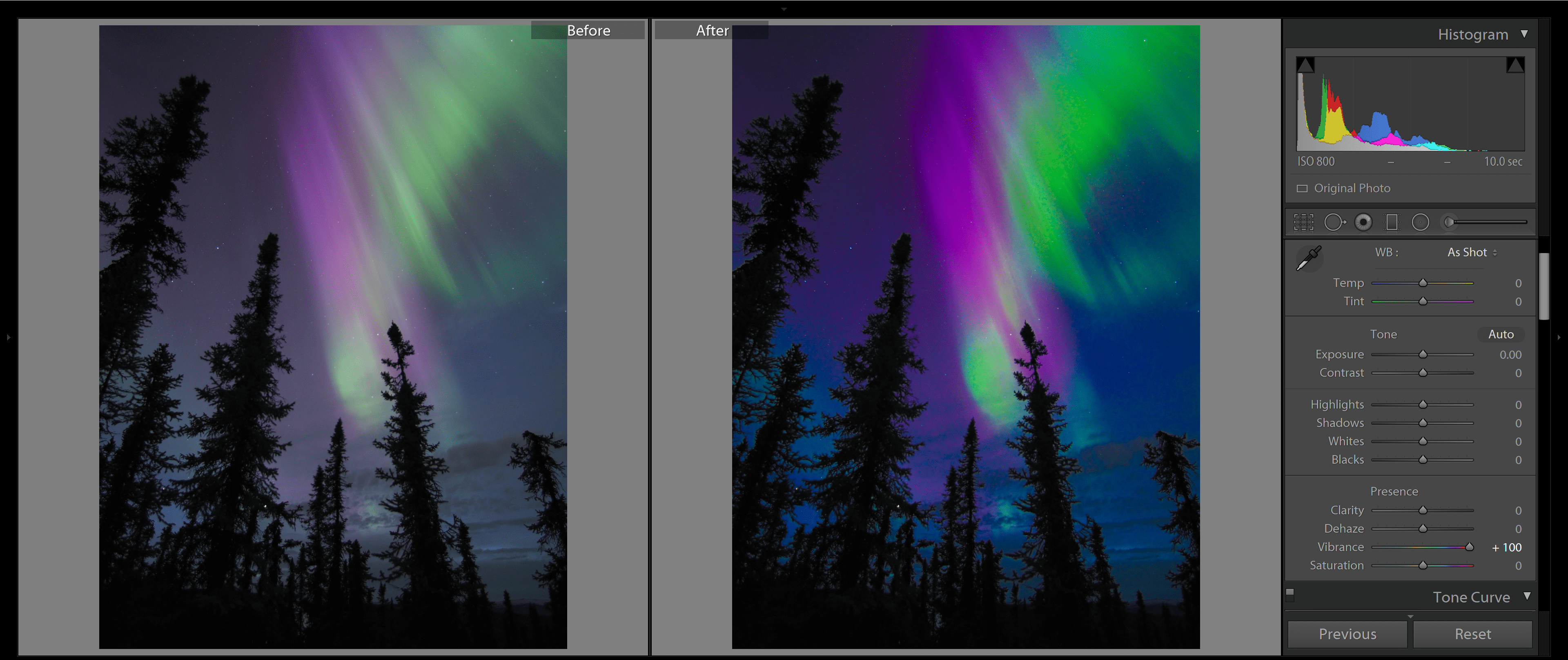
Next, add a second layer. The layer type doesn’t matter; just do what works for your file. It can be a text layer, an adjustment layer, etc. I’ve used a raster layer that contains this image:

Multiply blend mode

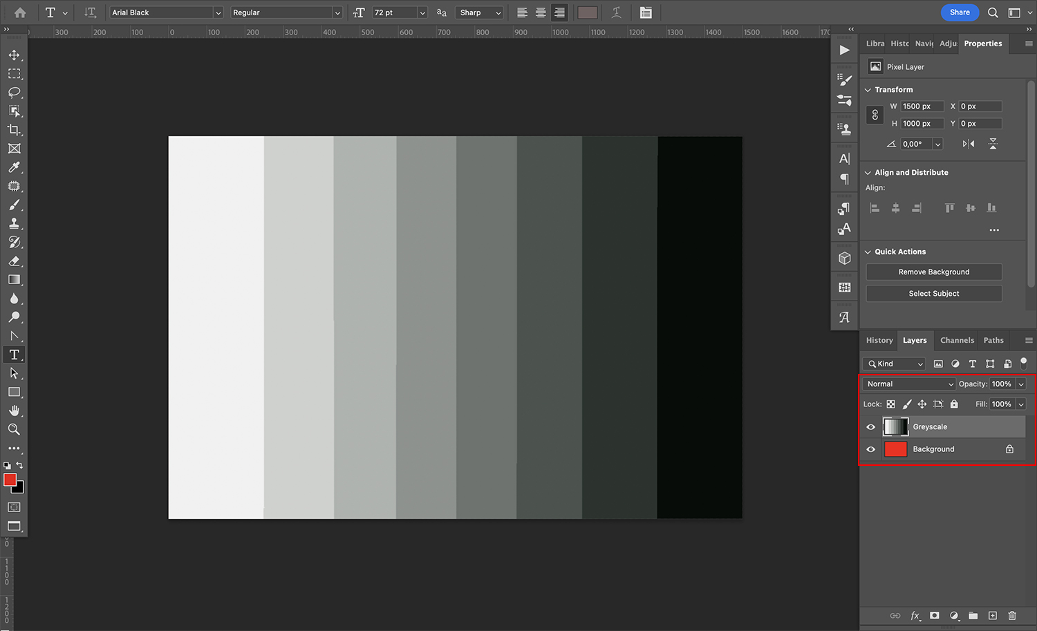
By default, the layer will completely cover the original layer beneath it.

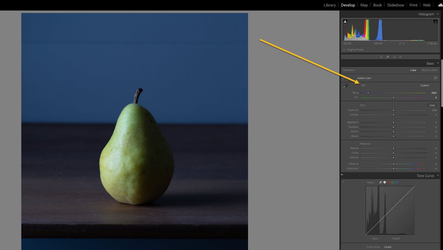
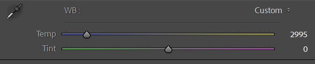
Next, go to the Layers panel. (If you can’t see this, you’ll need to open it. To do so, simply choose Window>Layers or press the F7 key on your keyboard.)

Toward the top of the Layers panel, you’ll find the blending options. You should see the blend mode on the left and the opacity on the right. By default, any layer will be set to Normal blend mode at 100% – but to use the Multiply blend mode, just click on the arrow next to the word “Normal” to open the drop-down menu:

Multiply blend mode

Find “Multiply” on the list. (Remember, you’ll always find it in the Darken section of the menu.) If you’re using Photoshop CC, you’ll see a preview as you hover over the Multiply option – but in Photoshop CS6, you’ll need to actually click to apply the mode before you can see the effect.

Now click on the arrow next to the percentage value to open the Opacity slider. Simply drag the handle of the slider to adjust the layer opacity. You can also input a value directly:

Multiply blend mode

Note: If these options aren’t enabled, it might be because your layer is blocked. Make sure your layer is selected and visible!

Do keep in mind that you need a layer underneath for the Multiply blend mode to have an effect. If you have a single layer and you change the blend mode from Normal to Multiply, you won’t see any difference. (The same is true if the layer underneath is a pure white background!)

Multiply blend mode: a step-by-step example

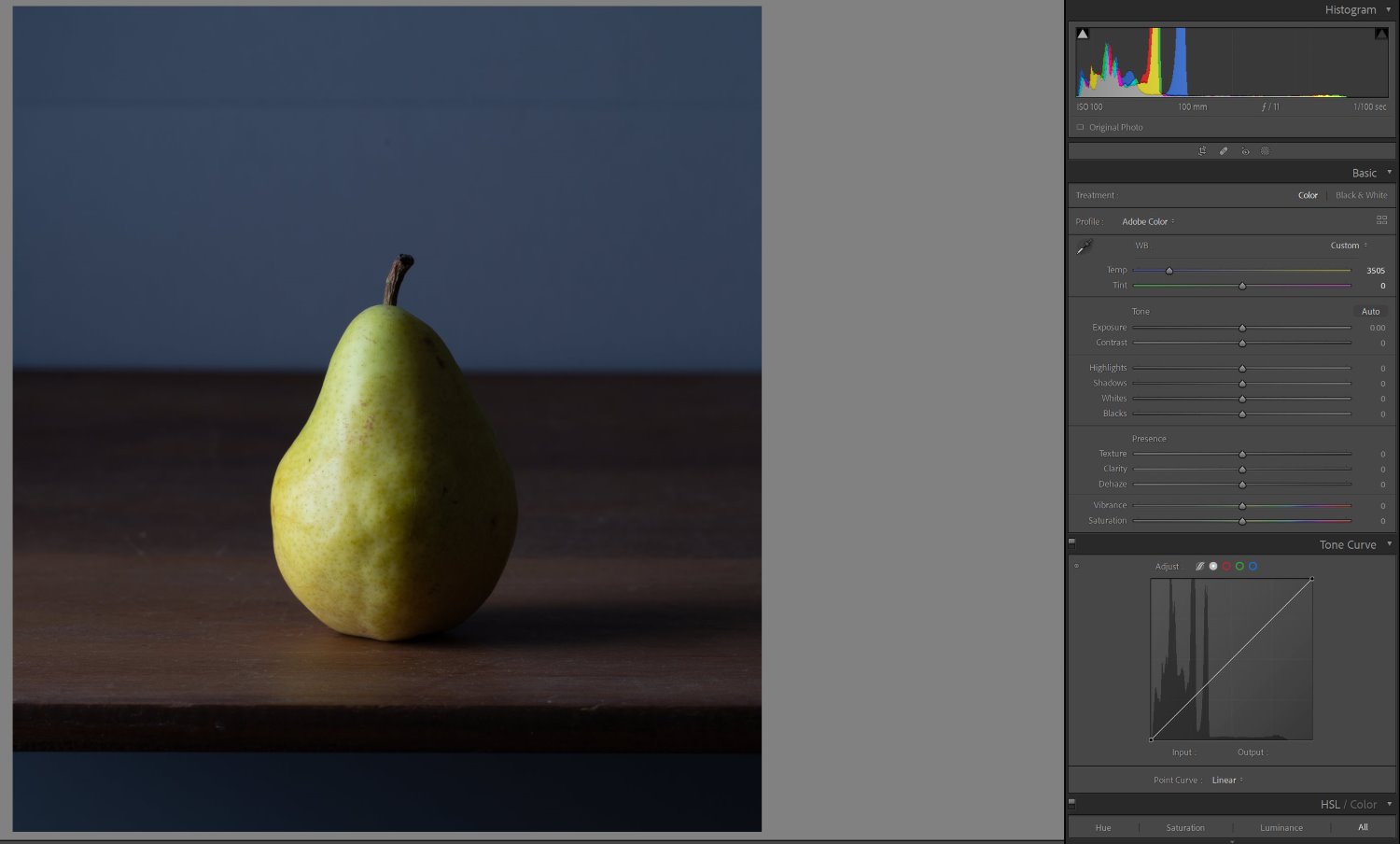
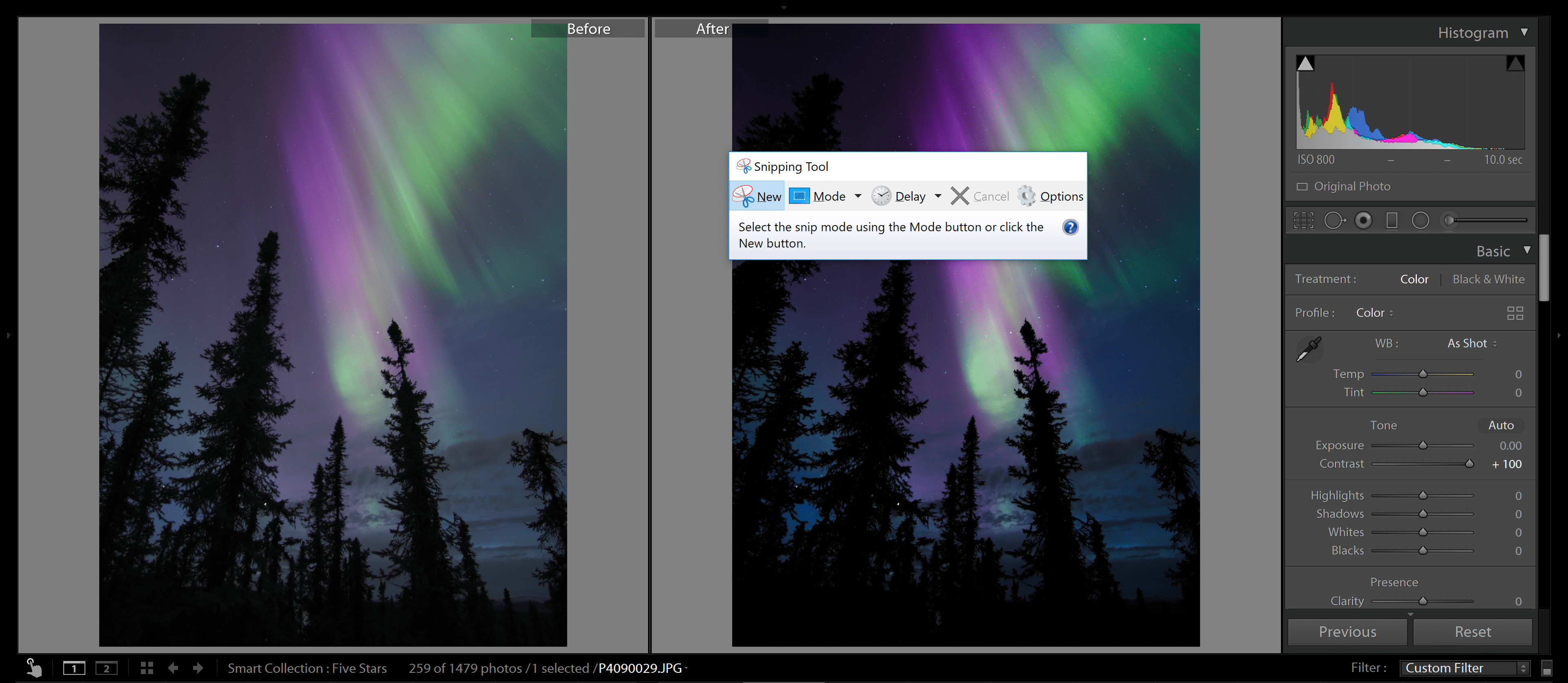
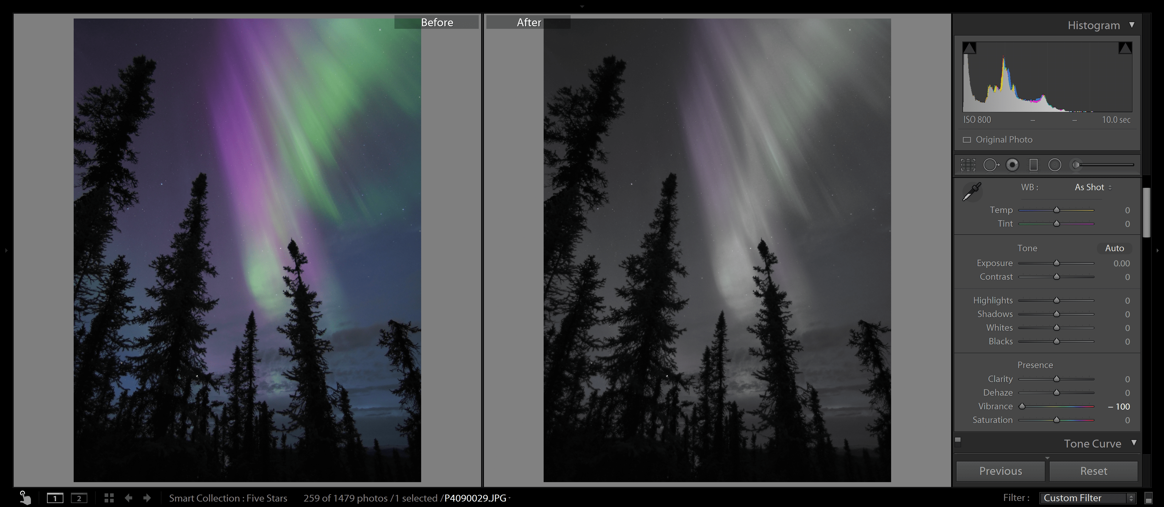
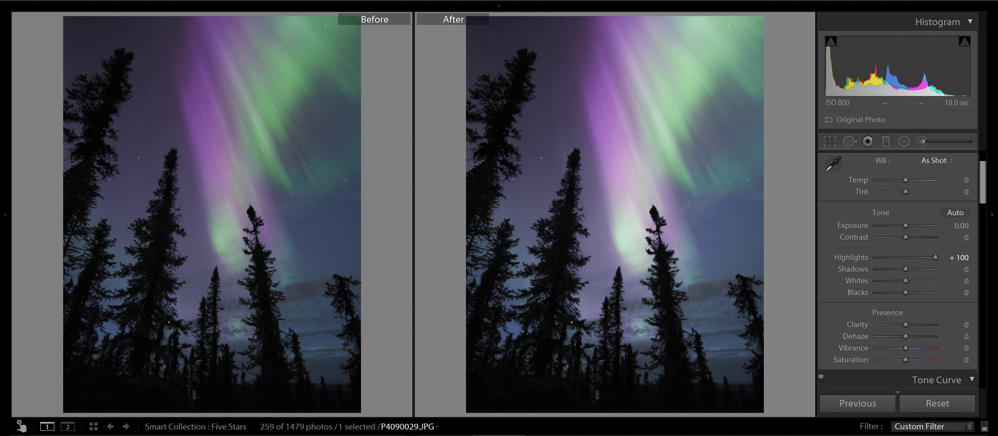
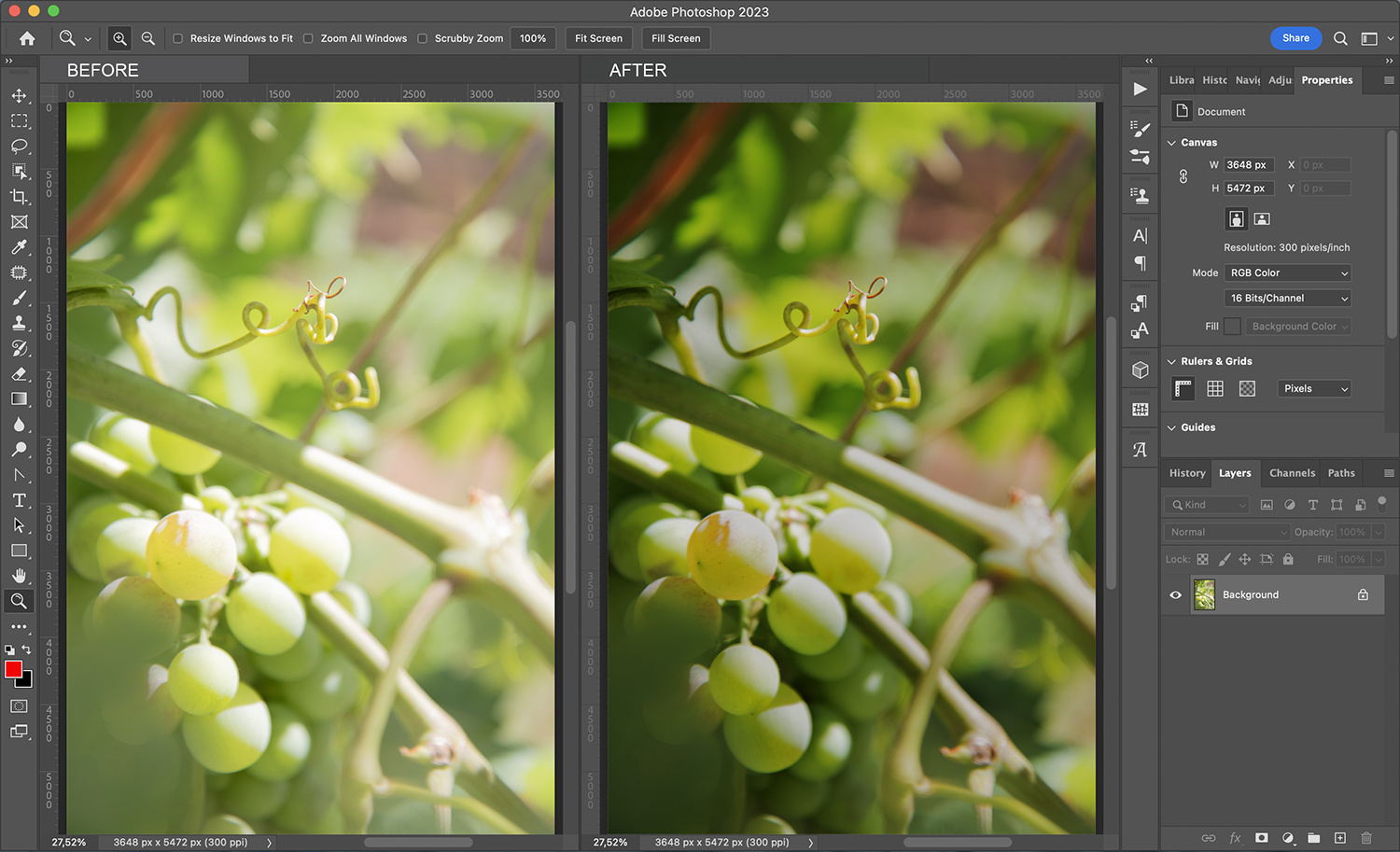
As I mentioned above, one of the common uses of Multiply blend mode is to fix an overexposed photograph. That’s what I’ll do for my example image:

Multiply blend mode

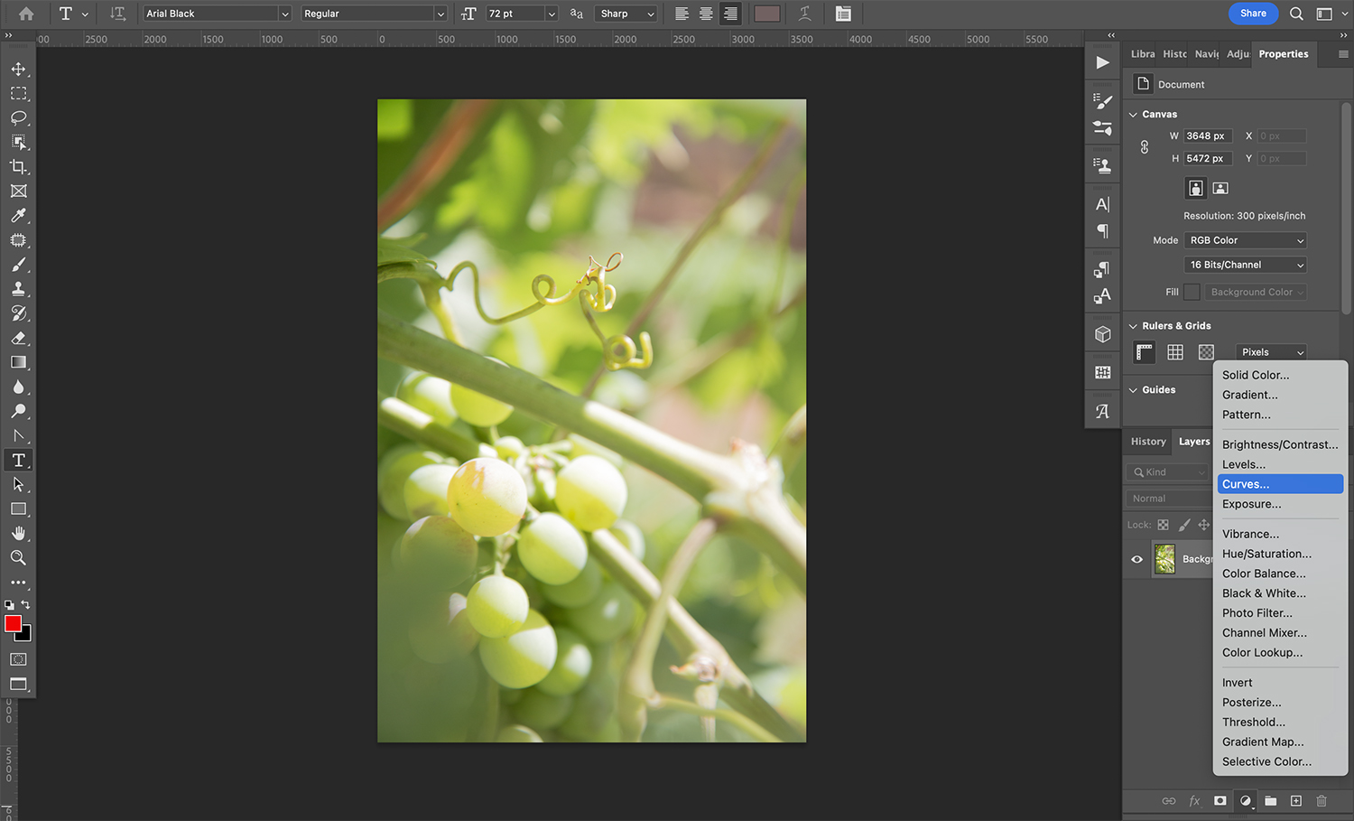
I’ve already opened my image on a new layer, so I’ll start by adding a Curves adjustment layer. You can do this by clicking on the “Create a new fill or adjustment layer” button at the bottom of the Layers panel:

Multiply blend mode

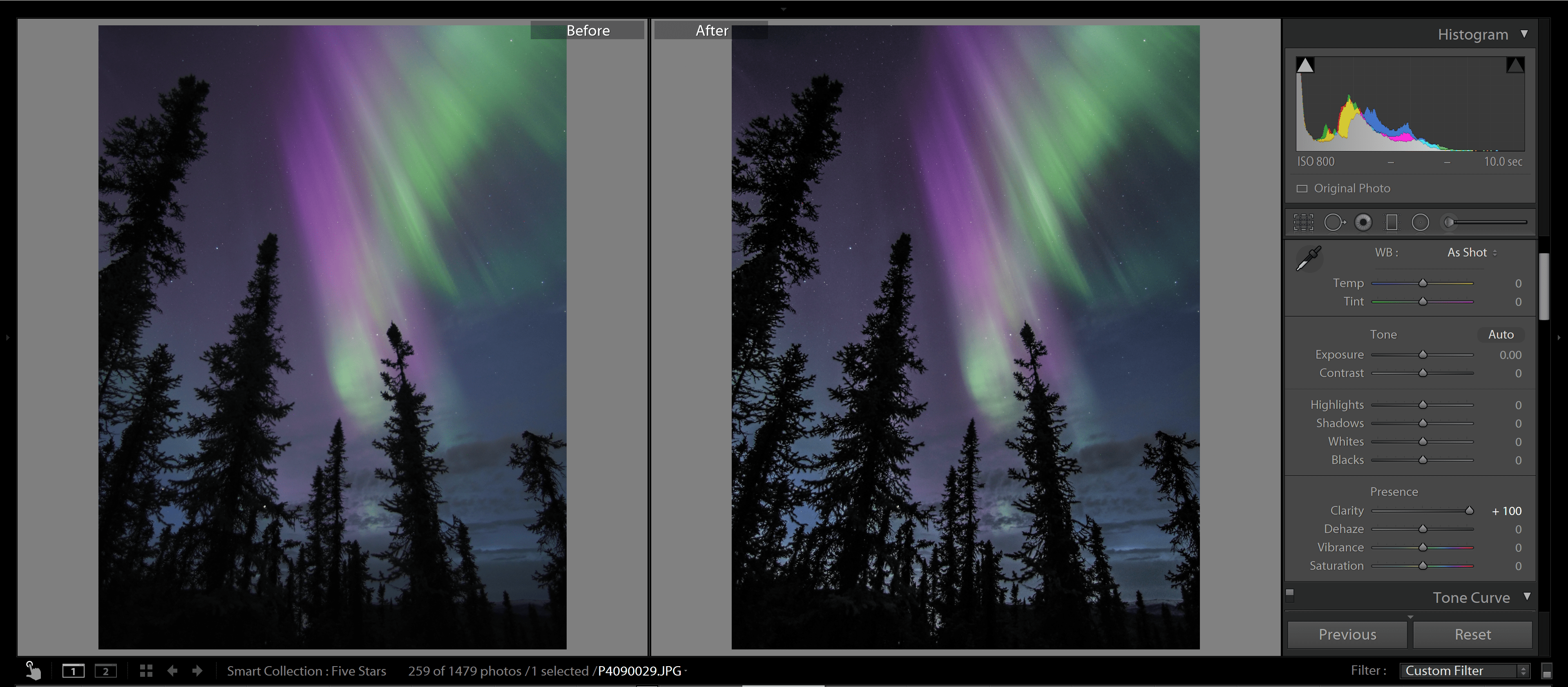
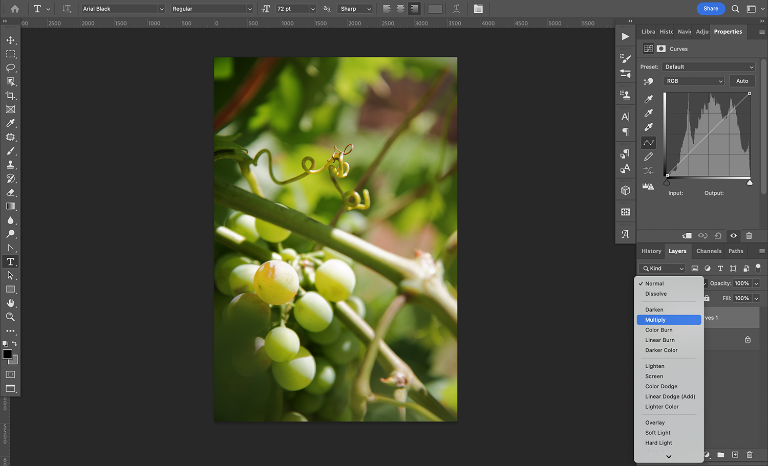
Without making any adjustments in the Curves properties panel, I’ll simply change the blending mode to Multiply, and the image will immediately darken:

Multiply blend mode

You can already see the difference, but if you want, you can also make some adjustments to the Curves layer:

Multiply blend mode

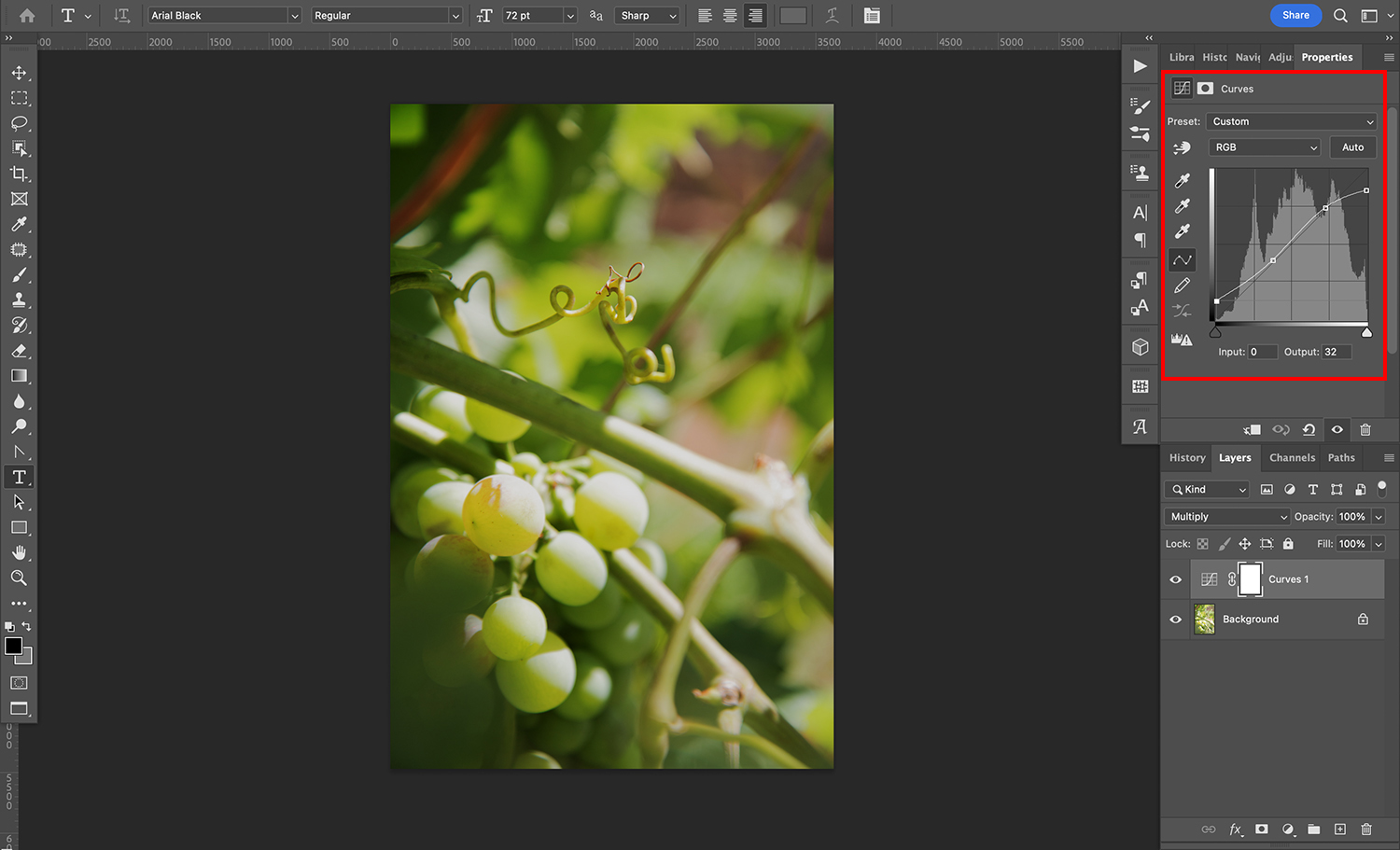
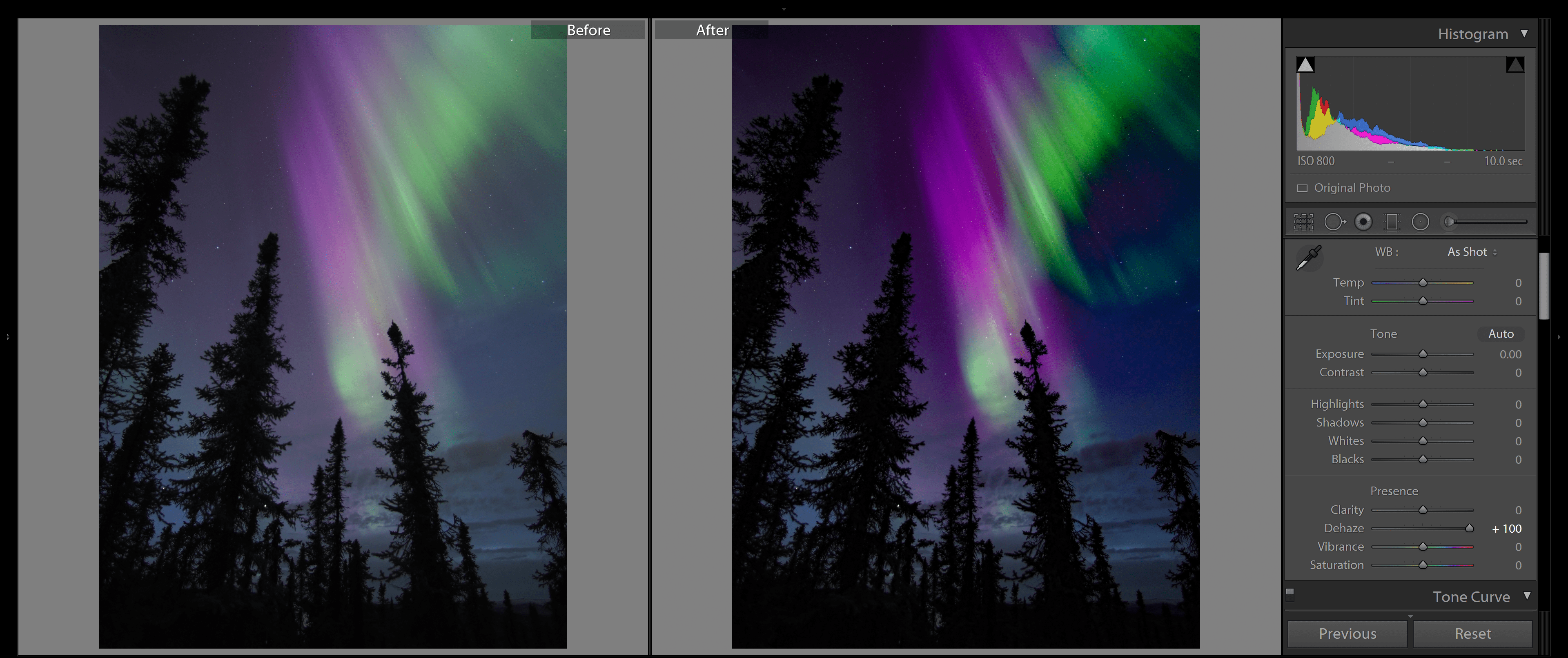
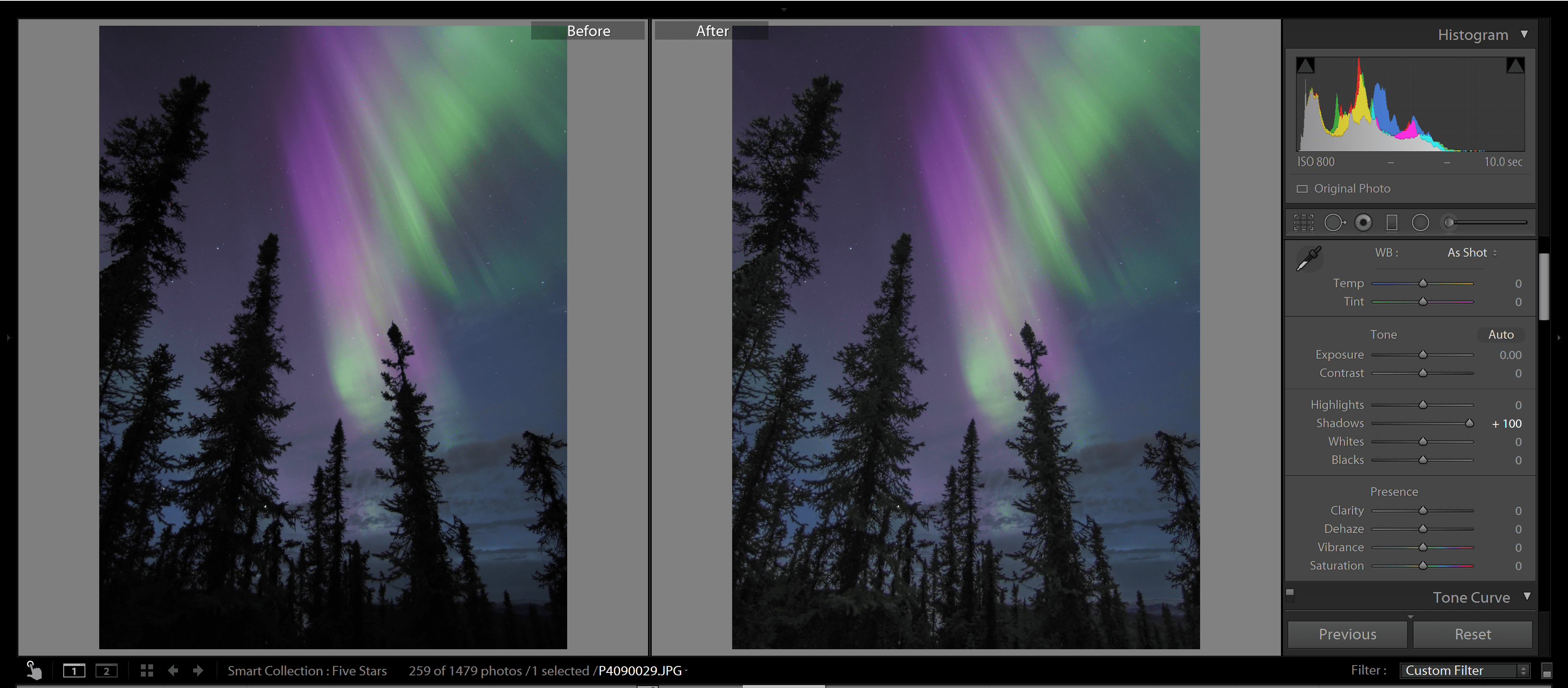
After adjusting the curve, it’s clear that the darker areas have become too dark. So I’ll lower the opacity a bit:

Multiply blend mode

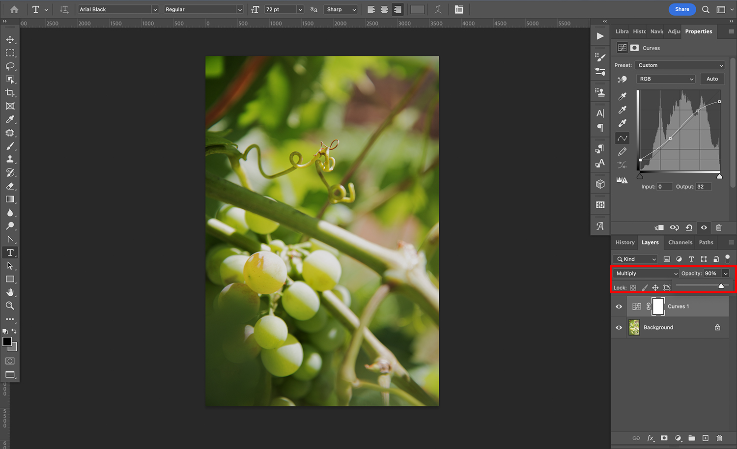
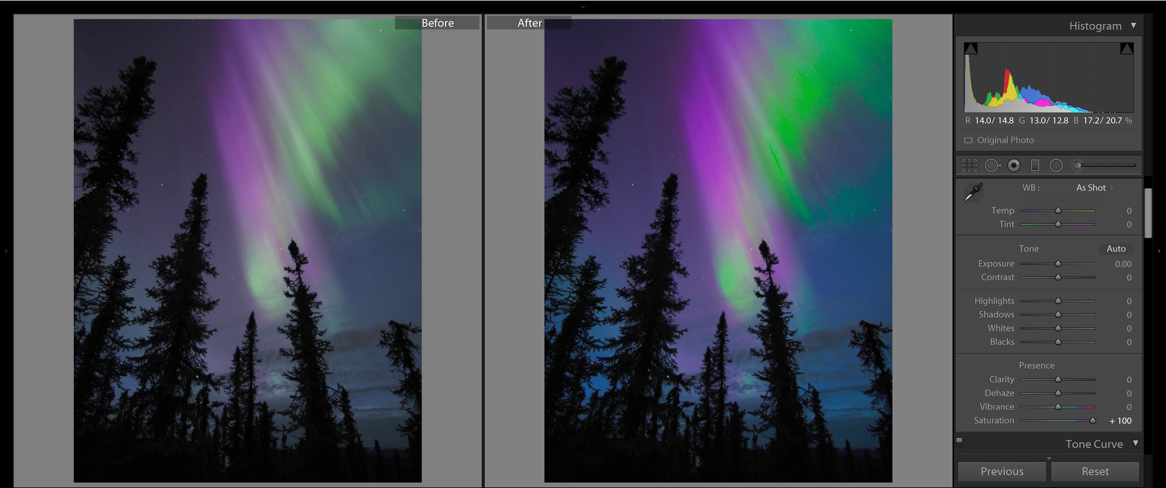
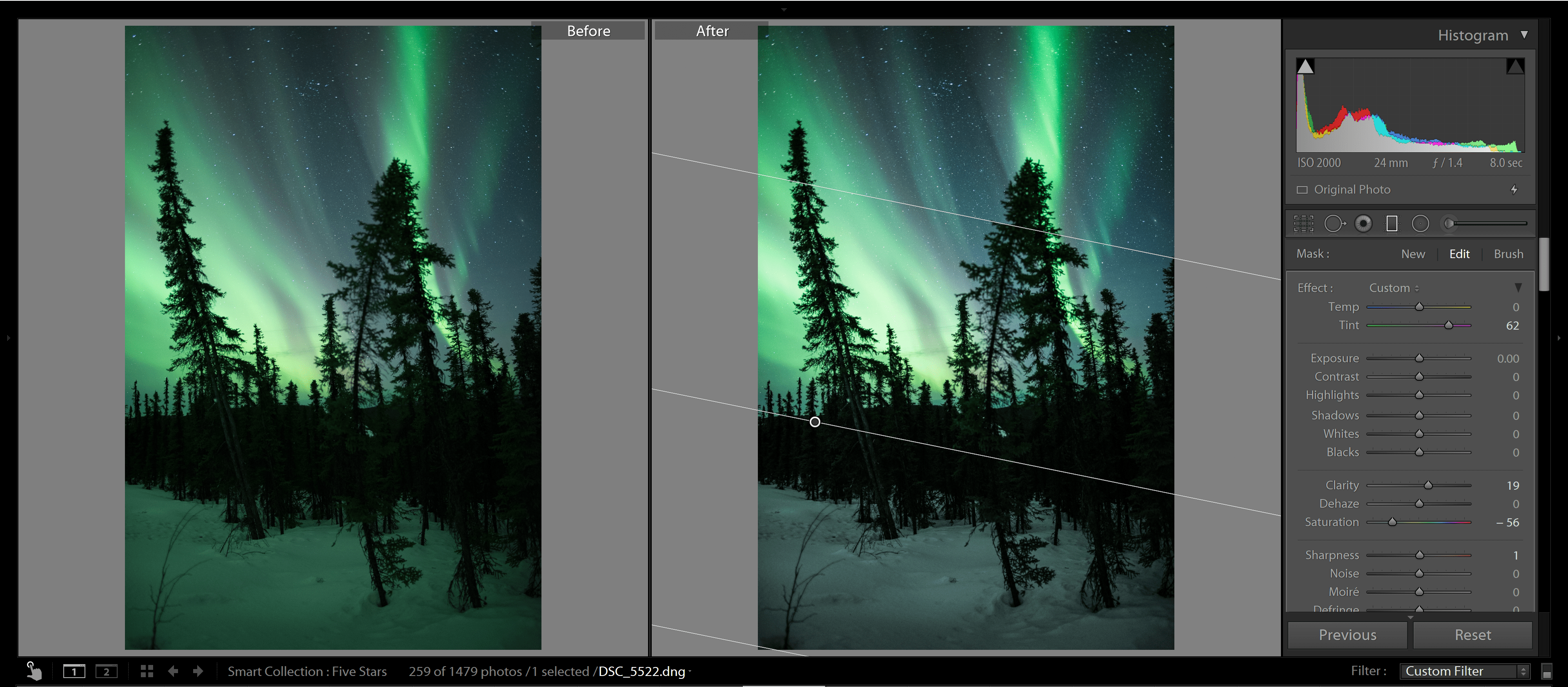
In my opinion, the brightest areas are too bright, so I’ll duplicate the Curves layer. (Duplicating a layer preserves its blending mode settings; in this case, my duplicate Curves layer is still in Multiply mode at 90% opacity.)

But I don’t want to darken the entire shot – just the too-bright areas – so I’ll fill the layer mask with black so that the second multiply effect isn’t visible. Then, using a white brush, I’ll paint over the brightest areas to reveal the darkening effect.

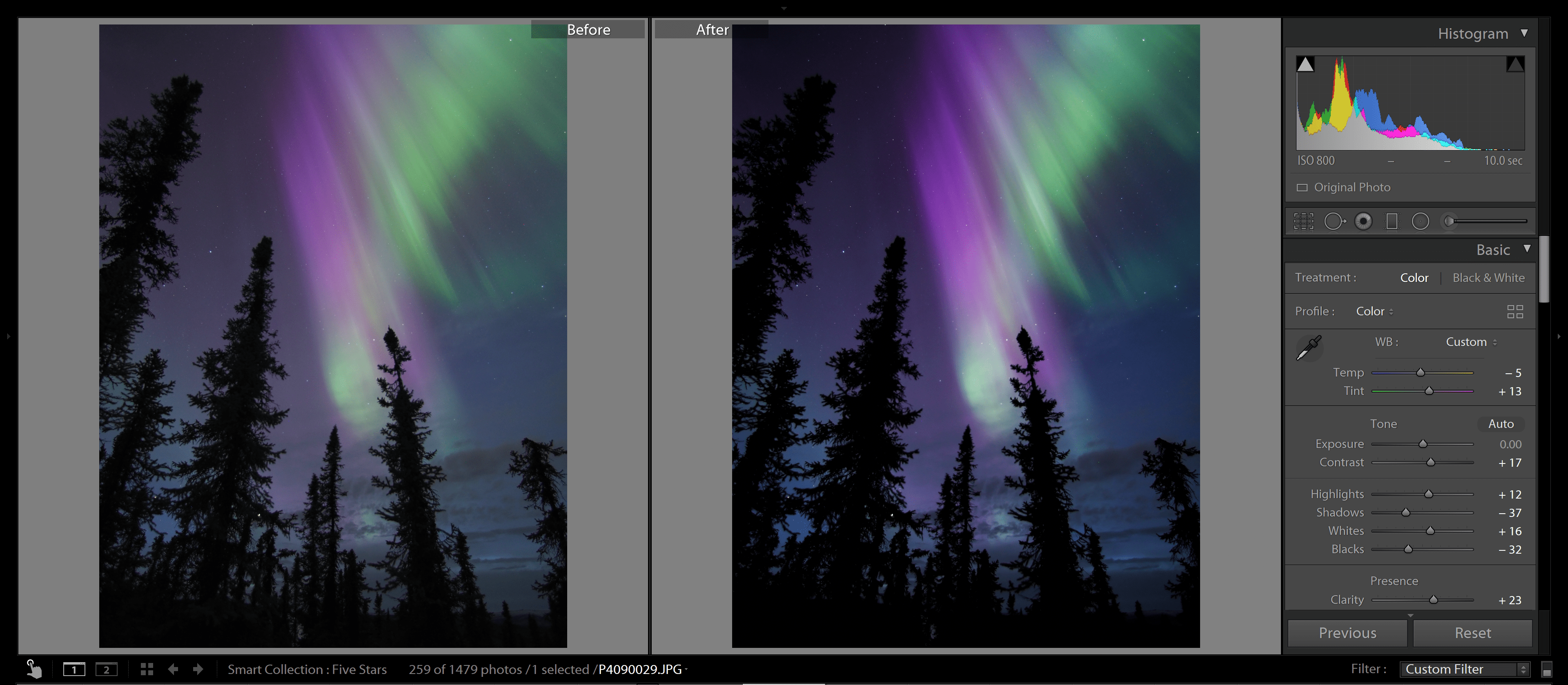
Here’s a before and after comparison:

Multiply blend mode

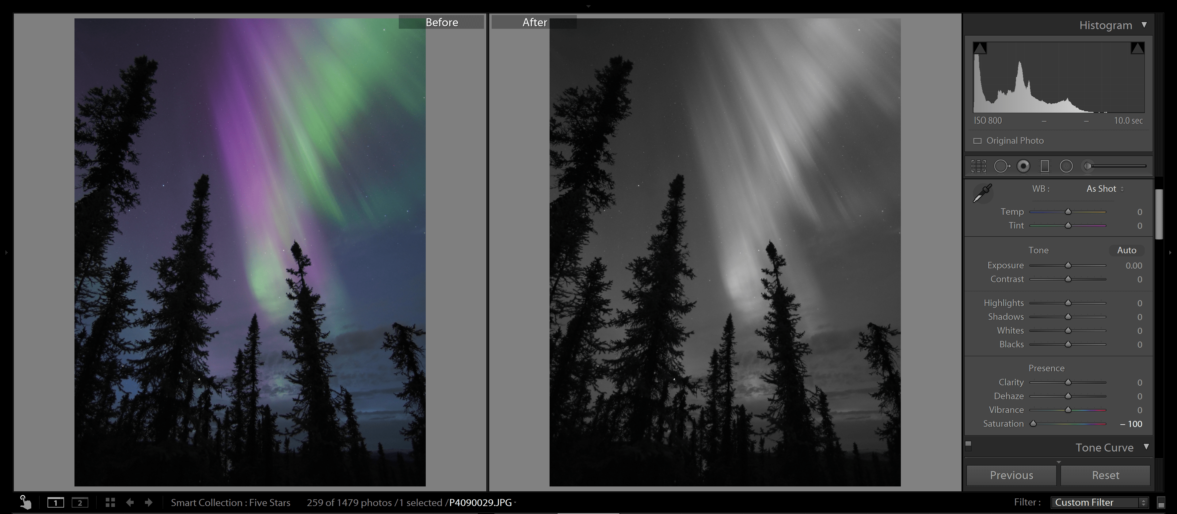
Multiply blend mode tips

Here are a few quick tips so you can fine-tune the Multiply effect according to your needs:

1. Try using Blend If

Multiply blend mode

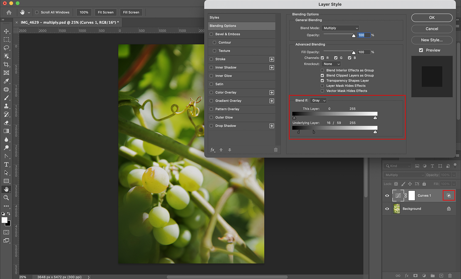
The Blend If feature allows you to adjust how layers blend according to their content.

For example, let’s say that the shadows of my image turn out too dark due to the Multiply mode. I can use Blend If to tell Photoshop to blend my top layer only with the brightest parts of the base layer. That way, I can darken the highlights without losing details in the shadows.

You can find the Blend If feature inside the Layer Style dialog box. To reach this, go to the Layers panel. Then double-click on the layer that you want to adjust. (Make sure you click in the blank space next to the layer’s name. Otherwise, you’ll open a different menu or feature!)

The Layer Style box will pop up, and you should then find the Blend If section. Here, you’ll see two gradients; the top one refers to the layer on which you’re working, and the bottom one refers to the layer underneath.

Simply click and drag the handles along these gradients to modify the blending effect. Note that each handle has a line in the middle, which allows you to split the handle and create a smoother transition. To do this, simply hold the Alt/Opt key and drag along the handle!

2. Use Multiply with brushes

The Multiply blend mode is not only available for layers; it can also be used with brushes. All you need to do is select the Brush tool, then head to the Options bar at the top of the screen.

Then open the Blend drop-down menu (next to the word “Mode”). Scroll down and click on Multiply:

Multiply blend mode

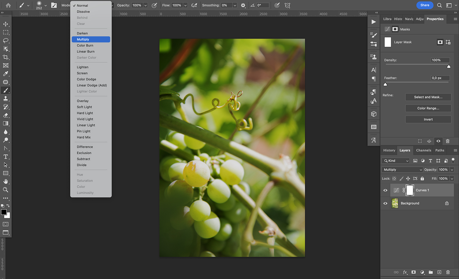
Then go ahead and paint with your brush! Whatever you paint will interact with the layer underneath by following the Multiply blend mode rules.

Multiply blend mode: final words

Now that you’ve finished this article, you know all about using the Multiply blend mode, so go ahead and try it out! See what you can create, and have some fun experimenting with different effects.

Note that, while I talked about using the Multiply blend mode in Photoshop, you’ll also find this effect in other editing programs that work with layers. And in most cases, it’ll behave in the exact same way!

How do you plan to use Multiply? Do you have any tips or tricks that I didn’t discuss in the article? Share your thoughts in the comments below!

The post Multiply Blend Mode: A Comprehensive Guide appeared first on Digital Photography School. It was authored by Ana Mireles.

White Balance in Photography: The Essential Guide

The post White Balance in Photography: The Essential Guide appeared first on Digital Photography School. It was authored by Darren Rowse.

The essential guide to white balance in photography

White balance. It’s a term that’s thrown around a lot in the world of photography, yet it’s unfortunate how many photographers are left scratching their heads when trying to explain or understand it.

Because here’s the thing: if you want to capture a scene as the human eye perceives it, then white balance should be on your radar. Mastering white balance, both during your shoot and in post-processing, can be the key to more natural-looking photos.

Therefore, in this article, I’m going to share everything you ever wanted to know about white balance, including:

  • The white balance camera settings you should use for consistently good results
  • How white balance can instantly improve your shots
  • How you can use white balance for gorgeous creative effects in your photos

I’m also going to explain key related terms, such as color temperature, white balance presets, and more.

And I promise you: by the time you’ve finished this article, you’ll be an absolute WB expert! Let’s get started.

What is white balance in photography?

White balance refers to the process of removing or neutralizing color casts in your images – because at its core, white balance is about ensuring the colors in your photograph appear as they do in real life.

You see, different light sources emit light with various temperatures and/or tints. Ever noticed how a photo taken under fluorescent lighting sometimes has a blueish hue? Or how shots by candlelight can seem overly warm or yellow? That’s the effect of these different light sources on your images.

Since photographers often want to produce images that look natural, white balancing involves carefully adjusting your camera settings or editing tools to counteract these color casts. It’s about taking an image like this, full of distorted, too-blue colors:

blue pear without white balancing

And adding warm colors until you balance out the color cast, so you get a final result like this:

pear with proper white balancing

You might be wondering: If lights have such strong color casts, how come I never notice them?

It’s a good question with a simple answer: human eyes are pretty good at correcting for color casts in real time, but a camera captures the subject as it looks in life. Sometimes, the subject will have neutral tones, but other times it’ll be very blue (as in the pear photo above) and sometimes very yellow (as in the pear photo below). In both the blue and the yellow cases, white balancing is necessary to create a neutral image.

Here’s a too-yellow pear photo, which requires significant cooling during the white balancing process:

pear with a warm color cast

Note that, during white balancing, you’re adjusting the colors along two spectrums:

  • The blue-yellow spectrum, also known as the color temperature
  • The green-magenta spectrum, also known as the color tint

In general, natural light only requires correction along the blue-yellow spectrum, but certain types of artificial lighting may produce a noticeable color tint, in which case you’ll need to correct for that, too.

Color temperature explained

The bulk of white balancing in photography consists of color temperature correction. You’re correcting for a cast produced by the color temperature of the light, which lies along the blue-yellow spectrum.

Think of it this way: some light sources exude a more yellowish glow, while others lean towards a bluish hue. When we encounter the former, it’s termed a “warm” color temperature. Conversely, the bluish tint signals a “cool” color temperature.

Photographers refer to different color temperatures using the Kelvin scale. Warmer color temperatures, such as those produced by a candle flame or a setting sun, have a low Kelvin value, such as 3000 K. Neutral color temperatures, such as midday sunlight, have a medium Kelvin value – around 5000 K. And cooler color temperatures, produced by clouds or shade, have a high Kelvin value of 6000 K and beyond.

Cooler light has a high Kelvin value? Warmer light has a low Kelvin value?

Yes, you read that right, and it can be confusing, especially if you’ve never encountered the color temperature scale before. But you’ll get used to it over time (and it can help to think of the color temperatures as simply the opposite of what you’d expect).

Why is white balance important?

Color casts cause a couple of problems in photography.

First, they prevent you from capturing accurate, true colors in a scene. If you want to photograph a beautiful red sunset exactly as it appears to your eye, you’ll need to neutralize any color casts; otherwise, your image won’t match the real-life conditions you experienced.

This can also be an issue if you’re doing product photography or real-estate photography, where the goal is to portray the subject as true to life as possible.

Second, color casts tend to look bad. They can mess with portrait skin tones, they can create muddy shadows and sickly highlights, and they can create unwanted moods in your photos.

As I explain later in this article, you can use a color cast for creative effect – but it’s important that you do this carefully and deliberately, rather than as a failure to properly white balance a scene. Make sense?

The two white balancing methods

You can adjust the white balance of your images in two broad ways:

  1. In camera, before taking a shot
  2. Afterward, in post-processing

Both approaches can work, but there are some important caveats to keep in mind:

In-camera white balancing

Most cameras allow you to adjust your white balance settings before ever taking a photo.

For instance, you can select a white balance preset (such as Tungsten, Flash, Cloudy, etc.), which allows your camera to roughly understand and compensate for the lighting conditions.

Some cameras also allow for a custom white balance. Here, you simply dial in a Kelvin value (remember the color temperature scale I shared above?). A high Kelvin value will balance out cooler light and a low Kelvin value will balance out warmer light.

Your camera may even be capable of white balancing off a gray card. Put the gray card in front of your camera, select the right function in the menu, take a picture, and – voila! – your camera will create an accurate color temperature profile of the scene.

But while these white balance options allow you to handle color casts in the field, they come with some drawbacks:

  1. Unless you’re in an enclosed environment, the light will likely change over the course of your shoot. You’ll need to periodically update your white balance preset or redo the gray card process as the sun goes behind clouds, as it sets, etc.
  2. White balance presets, while easy to use, are only approximate. They often won’t produce a perfect result.
  3. If you’re shooting action from a distance, taking a gray card reading is impossible.

That’s why some photographers prefer a different method of white balancing:

White balancing while editing

White balancing in post-processing is pretty simple:

Just set your camera to its Auto White Balance function when out shooting.

Then, when you get back home, open your photos in your editing program of choice.

Most editors offer a similar process, which involves using the white balance eyedropper to identify a neutral tone and fine-tuning via the Temperature and Tint sliders. (Below, I give a step-by-step process for white balancing photos in Lightroom.)

You can white balance each photo individually, or you can create a white balance adjustment for one (or a handful) of photos, then sync the adjustment across the entire set.

After-the-fact white balancing is nice, but like in-camera white balancing, there are a few points you need to keep in mind.

  1. You’ll need to set aside extra time in post-processing to do your white balancing. And while you can save time with batch processing and presets, if you’re capturing lots of images under different lighting conditions, you may prefer the relative ease of in-camera white balancing.
  2. Unless you take photos with a gray card in the frame, you may struggle to get a perfect white balance result with editing. In many cases, that’s fine – the color cast may be barely perceptible – but if you’re photographing products, your client may require literally perfect colors.
  3. For complete white balancing flexibility in editing, you must shoot in RAW. While JPEGs allow for some white balance adjustments, you’ll be limited an often-unacceptable amount – whereas RAW files let you completely set and reset the white balance.

So while post-processing and in-camera white balancing are both serviceable, you’ll ultimately need to choose the option that works best for you.

How to white balance using in-camera presets

While white balance presets aren’t the most accurate way to color correct, they’re an easy way to get started (and if you’re simply capturing photos to share on social media, they may be all you require).

Simply pull up your in-camera white balance menu. You should see several presets, such as:

  • Sunny, which works for mid-morning and mid-afternoon sun
  • Shade, which works for scenarios with heavy shade (e.g., portraits under a tree)
  • Cloudy, which works for outdoor scenes featuring overcast lighting
  • Flash, which works for scenes lit by standard off-camera speedlights and pop-up flashes
  • Incandescent, which works for indoor scenes lit by standard warm bulbs
  • Fluorescent, which works for indoor scenes lit by fluorescent bulbs

Then pick the preset that most closely matches the lighting conditions you’re experiencing and start taking photos! You will need to pay close attention to the light as you continue shooting; if it changes significantly, you should switch presets to reflect the new conditions.

How to white balance your photos in Lightroom

Lightroom color correction is a quick and painless process.

First, open an image in the Develop module, then find the WB section on the right-hand side:

adjusting the white balance in Lightroom

Next, select the Eyedropper icon:

the Eyedropper tool in Lightroom

Then click on a part of your image that should look a neutral gray or white. (Don’t be afraid to click in a few different places, especially if you’re not sure what counts as “neutral.”)

hoving the Eyedropper tool over the subject

If you can’t find a neutral area to sample, or you don’t like the results, you can always head over to the Temp and Tint sliders:

white balance temperature and tint

You probably won’t need to adjust the Tint slider much, but feel free to drag the Temp slider back and forth until you get a neutral image.

A white-balanced photo of a pear in Lightroom

How to creatively use white balance for different effects

While it’s always important to start by color correcting your photos, you can sometimes enhance images by deliberately pushing the white balance in the wrong direction. This generally works best when applied in a post-processing program, not in camera (though you can technically do it either way).

The idea here is simple:

By applying a too-cold white balance to your photos, you can create a somber, moody effect.

And by applying a too-warm white balance to your photos, you can create a welcoming, inviting, even nostalgic effect.

I don’t recommend you push the white balance too far – at some point, your photos may look unnatural – but a bit of cool or warm color is often nice when added carefully.

Note that you can also use an “incorrect” white balance to exaggerate the conditions of the scene. Adding cool hues will give images a shady or night effect, while adding warm hues will give images a sunrise or sunset effect. Again, use this technique with care. It’s easy to go overboard and end up with garish, unpleasant results.

White balance in photography: final words

Now that you’ve finished this article, you’re ready to start adjusting the white balance in your photos so you can capture truly lifelike, authentic images.

Remember, however: don’t be confined by the idea of “correctness.” As with many elements in photography, white balance can also be a tool for artistic expression. Explore, experiment, and embrace the power of white balance to transform the mood and atmosphere of your shots.

So go out with your camera. Practice working with white balance. And make your images shine!

Now over to you:

What do you think about white balance in photography? Do you have any tips for improving your results? Share your thoughts in the comments below!

White balance FAQ

Why is white balance important in photography?

White balance ensures that the colors in your images are accurate and natural. Incorrect white balance can lead to color casts, detracting from the image’s overall quality and authenticity.

What is the difference between white balance and color temperature?

White balance compensates for the color casts produced by either color temperature or color tint shifts. On the other hand, color temperature specifically refers to where the light falls on the blue-yellow spectrum.

How do I know if my white balance is correct?

The simplest indication is when the colors in your image appear natural and true to the scene!

Can you adjust the white balance in post-processing?

Yes, you can. Many editing software options allow for white balance adjustments, giving photographers the flexibility to refine the white balance even after a shot has been taken.

The post White Balance in Photography: The Essential Guide appeared first on Digital Photography School. It was authored by Darren Rowse.

Lightroom Star Ratings: A Quick Guide

The post Lightroom Star Ratings: A Quick Guide appeared first on Digital Photography School. It was authored by Ian Johnson.

Lightroom Star Ratings: A Quick Guide

Let’s face it: Sorting and culling your pictures after a shoot can feel like a never-ending task. Whether you’ve spent a wild weekend capturing wildlife or a bustling day capturing a wedding, sifting through hundreds or even thousands of photos to figure out which ones to keep, edit, and store can drive you crazy.

Fortunately, Adobe Lightroom’s star-rating system is a superhero tool that helps you efficiently organize and store your precious images. If you’ve been struggling to keep your photos well-managed, then it’ll be an absolute game-changer – as long as you know the right approach.

In this article, I’ll explain everything you need to know about using star ratings in Lightroom, including what star ratings are and how they work, plus some handy tips and tricks to keep your workflow fast and efficient.

Ready to get your photos organized? Let’s dive right in!

What are Lightroom star ratings?

Star ratings refer to one of Lightroom’s handiest image organizational features: the ability to apply a rating (from 0-5) to each and every image in your catalog.

The star rating option will appear underneath your photos in the Library module:

Lightroom star ratings

You can click to apply a rating (and if you choose a rating by mistake, you can always click on the stars again to remove it).

You can also apply star ratings in Grid View. Simply click the dots at the bottom of a photo:

Lightroom star ratings

And you’re done! Note that you can always use the Lightroom Sort option to sort photos by rating:

Lightroom star ratings

Or you can filter based on specific ratings (e.g., 3 stars and above):

Lightroom star ratings

How to improve your workflow with Lightroom star ratings: 4 tips

Star ratings have the power to revolutionize your editing process. In this section, I’ll share a handful of valuable tips to supercharge your workflow, starting with:

1. Embrace the magic of hotkey stars

Earlier, I talked about assigning ratings by clicking on the corresponding stars underneath your images. And sure, it’s an effective approach – but did you know that you know you can assign star ratings from 0 to 5 using your keyboard? These awesome hotkeys are what make the star rating system incredibly convenient.

In fact, if you have hundreds of photos to edit, this can dramatically cut down your time spent in Lightroom. Simply open an image in the Loupe View, press a hotkey to assign a star rating, then press the right arrow key to advance to the next file. You can blow through entire batches of images in seconds!

And if you want to go even faster, enable Lightroom’s Auto Advance feature by selecting Photo>Auto Advance. That way, once you rate an image, you won’t even need to press an arrow key; the program will automatically advance to the next photo.

2. Use star ratings to prioritize your photos

So you’ve just imported a bunch of photos, whether they’re wildlife shots, wedding moments, sports highlights, or captivating portraits. Now comes the burning question: Which ones are worth keeping? When you’re out in the field, you may capture multiple shots of similar subjects in slightly different settings or poses. At a wedding, for instance, you’ll have tons of dance photos, but only a select few will make the final cut.

This is where the star rating system swoops in to save the day. By assigning different ratings depending on the quality of each image, you can quickly categorize your shots and make sure that the best photos get shared and edited and the worst end up in the “delete” pile.

Lightroom, Stars, Workflow, Help
There’s a lot going on during a wedding. And when the day is over, you need to import the photos, then choose which you’ll keep, which you’ll develop, and which you’ll delete. Lightroom’s star ratings can help you out!

(By the way, here’s why I prefer the ratings system over the flag system: With star ratings, you get to be far more granular. Not only do you select the images to edit and delete, but you can also identify which images to edit first and which to edit down the line. You’re not limited to the binary “yes” and “no” of the flags.)

Now, you can assign rating values that align with your personal preferences, but here’s a suggestion: Let “0” (no rating) be your delete category. Then, designate “1” as the keep-but-low-priority-for-editing category—these could be your b-roll shots for applying general presets. Then, when you set an image to “2,” you’re saying it deserves immediate development, and when you assign a “4,” you’re signaling that it’s one of your absolute best shots. This tiered rating system ensures you only have to go through your images once – and ideally not more than twice. Trust me, it’s a massive time-saver, especially when you’re dealing with a large volume of files!

Quick note: I strongly advise against using “5” in your workflow. Reserve that rating exclusively for your top-notch, highest-quality images.

Once you’ve rated your shots, go ahead and sort them by rating. Then dive into the editing process as needed!

3. Use Smart Collections to create a portfolio

No doubt you’ll capture some amazing shots that you’ll be proud of and will want to keep for future reference, printing, or showcasing in your portfolio. As I mentioned earlier, these exceptional images deserve a five-star rating. (Remember: Only a select few shots should achieve this!)

To gather all your best shots in one place and create a stunning portfolio, Lightroom offers a nifty feature called Smart Collections. Think of it as your personal assistant that automatically gathers all images in your catalog with a specific attribute.

Here’s how you set it up: In the Collections tab, choose the Plus icon, then select Create Smart Collection:

Lightroom Star Ratings: A Quick Guide

Next, give your Collection a name (such as “Portfolio”), and add some selection criteria. You can base it on any attribute you assign in Lightroom – whether it’s stars, flags, keywords, or more. In our case, we want to collect images with a five-star rating, so we’ll create a single rating rule:

Lightroom, Stars, Workflow, Help

Finally, hit Create, and watch as your Smart Collection – with all your five-star images – appears!

As you continue your photographic journey, your five-star collection will keep growing, beautifully documenting your progress and telling your unique story!

Lightroom, Stars, Workflow, Help

4. Use stars to categorize subjects

This method of using star ratings is quite unique, but it can work wonders, especially if you’re keen on keywording your images.

Imagine you’re a bird photographer. Throughout the day, you’re constantly switching subjects, photographing different bird species left and right. When you import those images into Lightroom, the daunting task of keywording awaits you. Well, fear not! The star rating system comes to the rescue, making it a breeze to sort through your feathered friends in no time.

Here’s how it works: Mentally assign star ratings to particular species, and then use hotkeys to swiftly assign the corresponding star rating to each image. Once you’re done “coding” your species with stars, simply filter them in Grid View.

Now you can focus on completing your keywording, knowing that you’ve effortlessly organized your shots. And if you want to remove the star ratings afterward, it’s as easy as highlighting the images and pressing the “0” key.

Note that this technique isn’t limited to bird photography alone; you can apply it to various photography scenarios!

Lightroom, Stars, Workflow, Help
The diversity of birds creates a diversity of shots. If you ever hope to find your images again, you need to keyword your collection. I used star ratings assigned to different species to help sort them and keyword them.

Lightroom star ratings: final words

Lightroom star ratings are like the secret sauce to streamlining your photo editing game. With just a few clicks, you can assign ratings to your images. That way, your photos will be neatly organized and ready to be edited. No more endless scrolling through folders and scratching your head trying to remember which shots were your favorites.

So embrace the power of Lightroom star ratings. Let them be your guiding stars in the vast universe of digital images. Take control of your workflow, save precious time, and unleash your creative genius!

Now over to you:

How do you plan to use Lightroom ratings? Share your thoughts in the comments below!

The post Lightroom Star Ratings: A Quick Guide appeared first on Digital Photography School. It was authored by Ian Johnson.

Editing Aurora Photos in Lightroom: 8 Essential Tools

The post Editing Aurora Photos in Lightroom: 8 Essential Tools appeared first on Digital Photography School. It was authored by Ian Johnson.

How to edit aurora images in Lightroom

One of the most amazing phenomena of the night sky is the aurora borealis (also known as the northern lights). For as long as humans have existed, the dancing, brilliant curtains of light have dazzled the viewers below.

The opportunity to see the aurora is often a bucket list item, and the opportunity to view and photograph the northern lights draws thousands of people to polar regions every year.

Advancements in digital cameras and photo editing software have created an incredible opportunity for you to edit your shots after a night out under the stars and lights. However, post-processing technology has, in my opinion, resulted in many aurora photographs that are over-processed to bring out a level of saturation and contrast that did not exist in the original scene. Because many of the colors of the aurora are so pure and contrast so intensely with the sky, it is easy to inject the equivalent of pixel-steroids into your images, resulting in an eye-catching but ultimately false effect.

It is my goal when editing aurora shots to enhance but not over-enhance. Understanding how each of the basic Lightroom editing tools impacts an aurora image can help you tell the story of a night out by making your file look like the sky did when you originally witnessed that beautiful light show. Below, I walk you through the different tools that are useful for aurora editing in Lightroom, and I do my best to explain how you can use each to your advantage.

Lightroom basic sliders

How to edit the aurora in Lightroom
For the images above, I minimally edited the aurora and was careful not to over-enhance it. Understanding how the Lightroom slider controls impact your aurora shots can help you achieve natural and beautiful edits of the northern lights!

To illustrate how my favorite Lightroom sliders – Contrast, Clarity, Dehaze, Tint, Saturation, Vibrance, Shadows, and Highlights – affect an Aurora image, it is easiest to look at how extreme values for each setting impact the image.

For each tool, I will walk you through how the slider impacts any type of image (i.e., I will explain what the slider does in general terms). I will then apply it at an extreme level to the same aurora image to show a before (no edits) and after (extreme applied) comparison.

1. Contrast

Contrast is a very useful slider and a fundamental one for editing. By definition, the Contrast tool darkens the darkest midtones in the image and lightens the lightest midtones.

In an aurora image, many darker midtones appear in the aurora itself. As you slide the contrast to 100%, you’ll see that the colors in the aurora darken, giving the image a more saturated look:

How to edit the aurora in Lightroom
Pushing the contrast to +100 increased the saturation in the Aurora, and the foreground shadows became much deeper. Boosting contrast and adding saturation or vibrancy can have a compounding effect and lead to an image that appears over-processed.

2. Clarity

The Clarity slider adds contrast to the midtones without adding much noise. The tool is often used to bring out texture and details.

As I said above, aurora colors generally fall into the midtones of your image, so a Clarity boost impacts them strongly. Boosting the Clarity to +100 adds definition to the banding of the sample aurora shot below because there are vertical dark lines in the sky. You may like the Clarity slider for aurora shots because it doesn’t add as much contrast as the contrast slider and can make stars in the image pop and seem crisper.

How to edit the aurora in Lightroom
Adding +100 Clarity increases the banding in the aurora and makes the stars more visible. The Clarity adjustment did not add any saturation or other artifacts to the image.

3. Dehaze

Similar to Clarity, the Dehaze slider increases midtone contrast and shadows to give the images a slightly darker and more saturated look.

The Dehaze slider was built to remove haze from a scene. However, when you apply its technology to an aurora shot, it adds a lot of contrast and saturation to the image. It’s a slider to use gently (if at all) for aurora image editing.

How to edit the aurora in Lightroom
In comparison to Clarity, the Dehaze slider adds a lot of contrast and saturation to the aurora image if it is boosted to +100. The Dehaze slider can be useful, but apply it sparingly (if at all) when editing your aurora images.

4. Saturation

The Saturation slider deepens, intensifies, and brightens the colors throughout the image.

In an aurora photo, you’re often dealing with very intense colors, so you will find it is very, very easy to overdo the Saturation slider. Use Saturation sparingly.

When pushed to +100, the Saturation slider gives the northern lights an almost neon appearance:

How to edit the aurora in Lightroom
Oversaturating your aurora image gives it a fake, neon look.

At -100, on the other hand, it strips all color from the shot:

How to edit the aurora in Lightroom
Bringing all of the saturation out of an image renders it black and white.

It might seem counterintuitive, but there are times when bringing the saturation out of your aurora image by -5 or -10 can help improve the file’s appearance and make it easier for the eye to comprehend the intensity of the northern lights.

5. Vibrance

Vibrance is essentially a less aggressive version of saturation. It’s a tool that increases saturation selectively, with an emphasis on cooler rather than warmer tones.

In aurora shots, the Vibrance slider provides a more realistic enhancement of the aurora’s colors. You can see in the examples below that there is still a real danger of going too far. A Vibrance value of +100 creates neon colors similar to overusing Saturation:

How to edit the aurora in Lightroom
You may find Vibrance to be great for natural aurora image editing. However, boosting it too much will still result in an over-processed image.

However, at -100, you can see a distinct difference from -100 Saturation. The -100 Vibrance adjustment does not remove all color from the sky:

How to edit the aurora in Lightroom
In contrast to Saturation, you can remove all of the Vibrance and still have some color left in the image.

When editing my aurora shots, I like to decrease the saturation slightly before increasing the vibrance; it’s a powerful technique to subtly improve the colors!

6. Shadows

The Shadows slider increases luminosity in the darkest parts of the image.

With a picture of the aurora, you have a distinct advantage in that the Lightroom program interprets almost any part of the image that is not the aurora to be a shadow. The Shadows slider, therefore, lets you brighten or darken your foreground very easily.

You can see in the +100 shadow example below how details were brought out of the shadows in the silhouettes of the trees:

How to edit the aurora in Lightroom
There is a very clear line – in an aurora image – between the highlights and the shadows. Increasing the Shadows slider will raise the luminosity of any part of the image not covered in by the aurora.

7. Highlights

The Highlights slider is the opposite of the Shadows slider and increases the luminosity of the brightest parts of the image.

Lightroom interprets any part of the image with the aurora to be a highlight. That means an increase in the Highlights to +100 effectively increases the exposure of the aurora. On the other hand, if you over-expose an aurora image in the field, decreasing the highlights can help you reclaim lost detail.

How to edit the aurora in Lightroom
There is a very clear delineation between shadows and highlights in an aurora image. Increasing the Highlights to +100 only impacts the brightness of the aurora. In this image, it gives the Aurora an overexposed, washed-out look – but that’s because I pushed the slider to +100.

8. Tint

The Tint slider is meant to be used for color correction in correspondence with the Temp slider.

When editing your northern lights photos, you can use the Tint slider to neutralize the snow, which tends to turn green during intense aurora displays. I like to use a Graduated Filter (i.e., a Linear Gradient mask), coupled with increased pink tints and decreased saturation to make the snow closer to white.

Often this helps your eye focus on the aurora and can restore balance to the shot.

How to edit the aurora in Lightroom
Using Tint to do color control on an Aurora image is a bit more advanced, but you will find that you can control the color of the snow by combining the Tint and Saturation slider controls.

Put it all together for a final edit!

Now that you know how each slider impacts your overall image, it’s time to combine each in moderation to achieve a final edit.

For the shot below, I wanted to make sure the banding in the aurora was enhanced along with the purples. My final edit brings out features of the image without over-enhancing it:

How to edit the aurora in Lightroom
Using the controls described in this article, I edited this aurora image to give it a natural look and enhance the features I liked most about it, such as the purple colors and banding.

Now I want you to experiment with editing aurora images! Please pick your favorite aurora photo, then do some post-processing based on the advice I’ve shared. Then share the results in the comments below! As I always say, pixels are cheap – so I hope you make lots of pixels while photographing the aurora and have fun editing them!

The post Editing Aurora Photos in Lightroom: 8 Essential Tools appeared first on Digital Photography School. It was authored by Ian Johnson.